
Accessibility is the practice of creating content that is usable by as many people as possible, including those with disabilities. It is important to design with inclusivity in mind—not only is it good design, it’s also a legal requirement under laws like ADA Title II and VA HB 2541.
The recommendations below will help you make your images projects more accessible to your audience.
Provide text alternatives for images #
For any image on your site that is meant to convey information you should make sure you are providing a text alternative (usually through an alt text field). Alt text should answer this question: What is the information conveyed by the image? Think from the perspective of a user who can’t see your image, what do you want them to know about it? Make sure to describe what additional content the image contains, not just how it looks. If a viewer uses screen reader software, the software will read out the alt text descriptions to the viewer. There are additional benefits of alt text, will be displayed in place of an image if an image file cannot be loaded, and helps search engines index an image properly.
Alt text can, and should, be added to all forms of visual media, including Word documents, PowerPoint slideshows, email newsletters, and PDF documents.
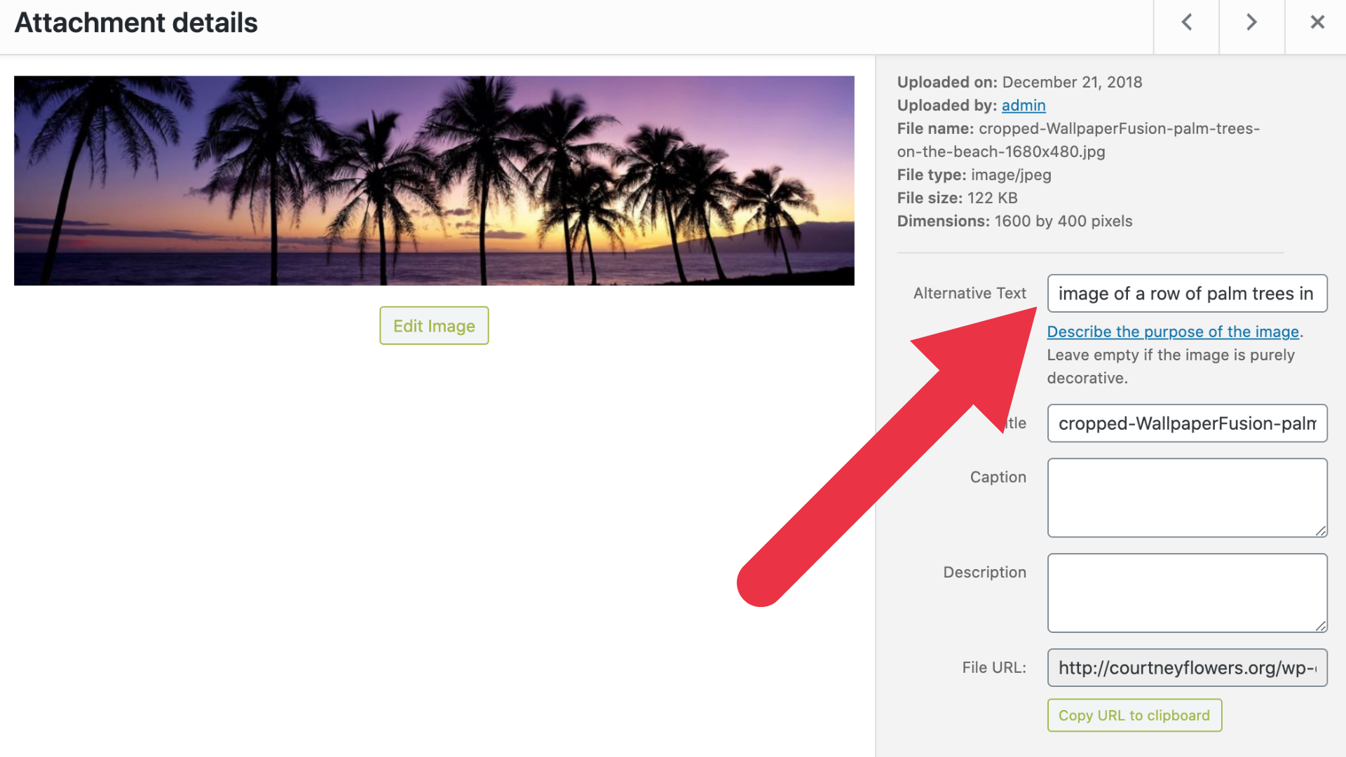
Alt Text in WordPress #
To include alt text on images uploaded to a WordPress site, you will need to edit an image’s metadata which can be done by going to the media library in your dashboard, clicking on the image you wish to add alt text for, and add it under attachment details.
Alternative text (or “alt text”) is used to describe the appearance and function of an image on a page. Alt-text is incredibly helpful for visually impaired viewers who are using screen readers but it also has many other benefits. Alt text will be displayed in place of an image if an image file cannot be loaded and alt text helps search engines index an image properly.
Colors #
Don’t use color alone to convey meaning. As shown by the example below, even without color this high contrast box plot is decipherable. Adding texture to a graph allows viewers with a visual impairment to be able to use this graph whether or not they can see the colors. Use the Colorblind Web Page Filter to run your site through different filters so you can see how it would appear to a person with various color blindness

High Contrast #
Use high contrasting colors. High contrast usually refers to a great difference in two colors’ values. In other words, one is very light and the other is very dark. High contrast design can help people with vision impairment understand the content of your site. While black and white might seem boring for text it is just about the most accessible thing you can do!

Use this Color Contrast Checker to ensure the color contrast on your site is appropriate.
Typography #
Use a large enough font size for body text so that people can comfortably read. Using 12pt (16px) is a good minimum but this can vary depending on the design of the font.
Choose a typeface that emphasizes clarity and legibility. Avoid using typefaces with letters or numbers that may be confused for each other or are hard to discern their shape.
Ensure that spacing between letters and lines supports legibility. Some tools allow you to control the line height and spacing between letters and lines. You’ll want to find a balance of of not too tight or too loose for readability.
Printed Media vs. Digital Media Accessibility #
While digital graphics may appear to be simple adaptations of printed media, there are some things you must consider that are specific to each medium in order to make it accessible for everyone. Digital and printed media overall have overlaps in terms of what to keep in mind, but it is important to remember the changes you do need to make.
Digital Media #
Descriptive Hyperlinks
Hyperlinks are incredibly helpful in digital designs because they allow for users to simply click and be taken to the linked page. However, it is important to include a description of the link’s target within the text of the hyperlink itself. Here are some examples:
Good: Descriptive Link Text
Learn more in our Accessible Visual Design Guide.
This link text clearly communicates where the link will take the reader. They can make an informed decision about whether they need to click the link
Bad: Poor Link Text
If you want to learn more, click here!
This text does not give enough information for the reader to know where the link will take them.
Worst: Naked Link
Here’s a link to find out more! https://www.google.com/search?q=dkc+visual+design
This link does not give clear information, and is an utter disaster for anyone using a screen reader.
Alternative Text:
Alt text is a great way to keep your digital designs accessible. Adding alt text to any images, tables, or other graphics creates a way for people with low vision or screen readers to know what the graphic is showing without actually seeing it.
File Type Awareness
Be wary of what file type you save your documents and graphics. Saving a text document as a PNG or other image-based file type will not be accessible due to the text only being available visually. Saving as a PDF (with accessible tags) allows a screen reader to access the information.
Print Media #
Print Size
It’s helpful to know how big a printed design will be because that impacts the sizing of a lot of the design’s elements. 12-point font may be the standard for common letter paper, but it may not be appropriate on a poster board or business card. Try finding something of equal size to get an idea of how big design elements should be so that everyone can view them.
QR Codes
QR codes can be very helpful, but sometimes they are simply not needed. QR codes are perfect for print materials like posters and fliers. But for digital images that users will most likely already be seeing on their phones or computers, QR codes complicated the process of getting to the linked page because users won’t be able to scan if they are already using their device to see the graphic. For digital media, it’s best to replace that QR code with a hyperlink.
Additional Resources #
Website Accessibility – Tips for designing websites with visuals that are accessible for all.
Color Contrast: For the Sake of Aesthetic and Accessibility – This article talks provides some practical tips for implementing high contrast design.
Image Concepts – This tutorial demonstrates how to provide appropriate text alternatives based on the purpose of the image.
Audio Description Project – A great resource for learning more about audio descriptions which includes samples.
Want More Help? #
- Book an appointment with a consultant at the DKC. We would love to help you with your video editing projects!
- Check out our Photo Editing Tool Guides, Graphic Design Tool Guides and our Free Media Resources List.
Updated by Cartland 08/08/25