Category: Uncategorized
-
Fourth Blog: Setbacks
This week’s Vlog is actually going to be a blog. The structure will be the same as my typical Vlogs. I’ll start off talking about what I learned in these two weeks, then I’ll talk about my goals for the next two weeks.
What I Did This Week:
This week was largely about making the actual Podcast again. I ran into some hiccups with Episode 3, which I’ll talk about in a minute. I’ve been struggling with motivation on the Podcast, so I’m taking the advice that many authors get when they are starting out: Read plenty of books. So, I’ve been doing the equivalent and listening to a lot of history podcasts. In some cases, I’ve been re-listening to old favorites. I would recommend the following to anyone interested in approachable but engaging podcasts about history:
The History of Rome – Mike Duncan. This one is a little old, but it is in many ways the blueprint for my own history podcast and others like it. It can sometimes be confusing and a little convoluted, but Mike Duncan uses his great writing skills and calming voice to keep it enjoyable.
Dan Carlin’s Hardcore History – Dan Carlin. He only posts once a year or so, but his episodes are worth the wait. He actually inspired the first series I’m doing with his episode “The Celtic Holocaust”. I think the main thing I take inspiration from is Carlin’s rhetorical method. He asks the audience a lot of questions, and I find it to be very engaging and thought provoking.
Revolutions – Mike Duncan. This is Duncan’s more recent series and it’s got a lot more polish. The history can get very convoluted, and it is more so targeted at people who are ‘fans of history’ so-to-speak. I take inspiration from his signposting in this series. He is always very clear at the beginning of the episode in terms of what he plans to talk about. It helps me follow along and I try to implement it into my own work.There are others, but those are the main ones I have been drawing inspiration from recently. I actually recorded Episode 4, but I was pretty unhappy with it. I went back and did some rewrites, and just last night I came into the DKC after-hours to record the rewritten episode. I added some new stuff that reflects what I mentioned above, and I like the episode a lot more now. I also wrote an email to a Podcasting friend of mine, Eric Halsey, who does a Bulgarian History Podcast. I need to catch up on his work, but he is definitely inspired by some of the podcasts I also enjoy. I tried recording myself in the podcast room last night, but I wasn’t super happy with it. I plan on doing more recording this week, and I’m going to try and record myself again.
What I Learned:
All in all, this week was a lesson on setbacks. I wanted to get Episode 4 out, but because it didn’t meet my expectations, it seems it will have to wait another week. Every creative person will tell you that setbacks are normal, but this sort of thing always feels a bit disheartening. Regardless, I’m hoping this week will be better and I’ll have a Vlog out that talks about all the great progress I’ve made!
-
#1: What is my Podcast?
History, it’s often said, repeats itself. This idea is outdated, and unfortunately, it doesn’t even rhyme. First and foremost, history reflects. Today, I would like to answer the question: what is my podcast? History: Rewritten is a podcast about the past. The past is something that, in spite of the popular conception, has an effect on our lives every day. What people believe about themselves is largely defined by their view of the past. If someone sees the past as a golden age long since passed, they will live their lives very differently from someone who believes they live in an age of progress and innovation. History is the driving force behind people’s identities. It is so much more than dry names and dates. My podcast is an attempt to combine the scholarly rigor of published academia while remaining relaxing and entertaining. I think that history is, first and foremost, a story. My fascination with science and nature was fostered by Bill Nye and Bill Bryson. While science still fascinates me, my own passion lies with history. My goal is to make the past come alive. People view history as—almost by nature—fixed and set in stone. But the past is no more fixed than the future. New evidence, new interpretations, and new perspectives are constantly altering our understanding of history. History is not simply a collection of austere marble statues, standing silent forever in some empty hall. Statues were painted, alive with color, and they were meant to be viewed by thousands of people every day. The past is changed by the present, because it allows people to see things that came before in a new light. History, in other words, is constantly being rewritten. I hope to inspire others to approach history as something worth seeing for themselves. Each individual views the world from their own totally unique perspective. Only by hearing other perspectives and understanding each side of an issue can a true solution be found. History has the remarkable ability to reflect our past back at us. Studying history is just as much personal reflection as it is rigorous scholarship. Every historian has a unique experience that they bring to their study of the past. I am sharing my own interpretation in the hope that others will one day do the same. If more people were willing to evaluate the past, I believe we would live in a more curious and compassionate society. In that way, my podcast is my own small attempt to rewrite the course of history.
Join me next time as I start designing my website, writing episodes, and more.
-
Baseball Podcasting: Fellowship Wrap-Up – Blog Post #8
The Podcast
As I probably could have predicted, I was unable to finish Episode 2 by the end of the semester. That is okay, I did start editing and it is hilarious. Michael adds to the vibe so much, I can’t wait to share the finished product. When that will be really depends on my access to internet after graduation, more on that later on, but I do plan on at least trying to continue this. If not right away I will pick it back up, but I have had too much fun with it to just stop. We will see where this goes from here.
The Website
It seems pretty much done to what I can make it. I do plan on building more of that out as I keep going and find more things to talk about and share, but for now I am proud of it where it is. It was fun to learn how to build and make something worth sharing with other people. I do still need to move ownership of the domain from the school to myself, but that seems like an easy enough process. I also made copies of all the content and saved them on my computer so I now have that to rebuild it in case it does not work to transfer the ownership.
Research and Creativity Day
This was a fun presentation. I was not at all worried about it, and I wound up having a hype squad of some Preservation Major friends who wanted to see what this project was all about and one other friend who also happened to be at my Conference Presentation in Gettysburg, so that was cool to have a support there. I was the third of three presenters in the session, so I got to end it well. I did just that, opening with a quote from Moneyball (The Movie): “How can you not be romantic about Baseball?”. That got some laughs and I just fed off that energy. I talked about the project, where it came from, things I’ve learned and picked up, basically everything in these posts with some more baseball sprinkled in. It was one of the better presentations I’ve given, and I did not have notes either, just talked about what felt natural. People loved it too, I am proud of that.
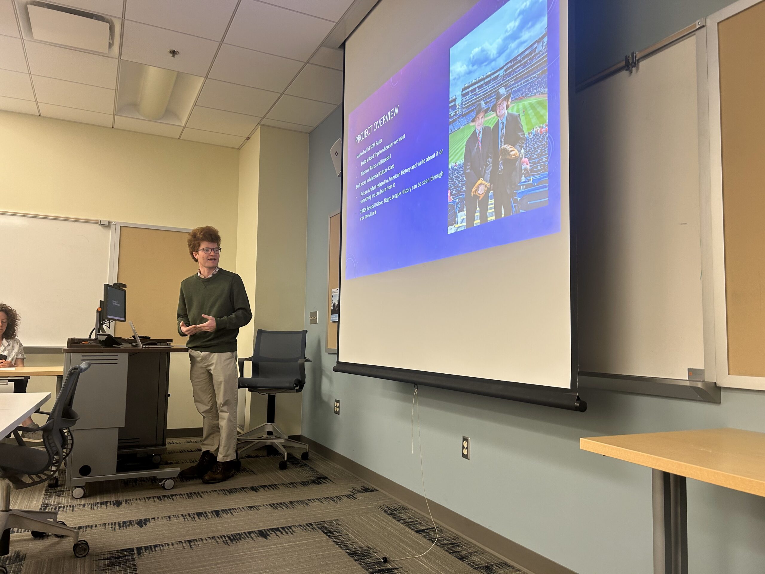
Me giving my presentation, pretty fun The End
This has been a fun project and a fun Fellowship. I learned a lot, found that I am more capable of using technology than I thought, and now have a pretty cool website to show for a pretty cool topic. I am glad I got to do this fellowship to build out the project more, so thanks to Cartland, Shannon, and the DKC for letting me do this and offering support! Thanks to everyone who has been following along too, you’re a big part of why I do this and why these stories matter, so you all rock for sticking with me! As far as the future goes, I am graduating in a week on May 10, then start a position on May 18 as a Seasonal Park Guide at Minuteman Missile National Historic Site in the Badlands of South Dakota. It should be pretty cool to interpret a different aspect of our history in the Cold War, so I am pretty excited. I’ll be living in park housing so that is why I am unsure of internet access, but even if I do not have it there, I want to continue this research and sharing after I get back. This is the last update for the DKC, but definitely keep checking preservingourpastime.com, because hopefully I’ll have some cool things coming. Thanks again, and wish me luck!
-
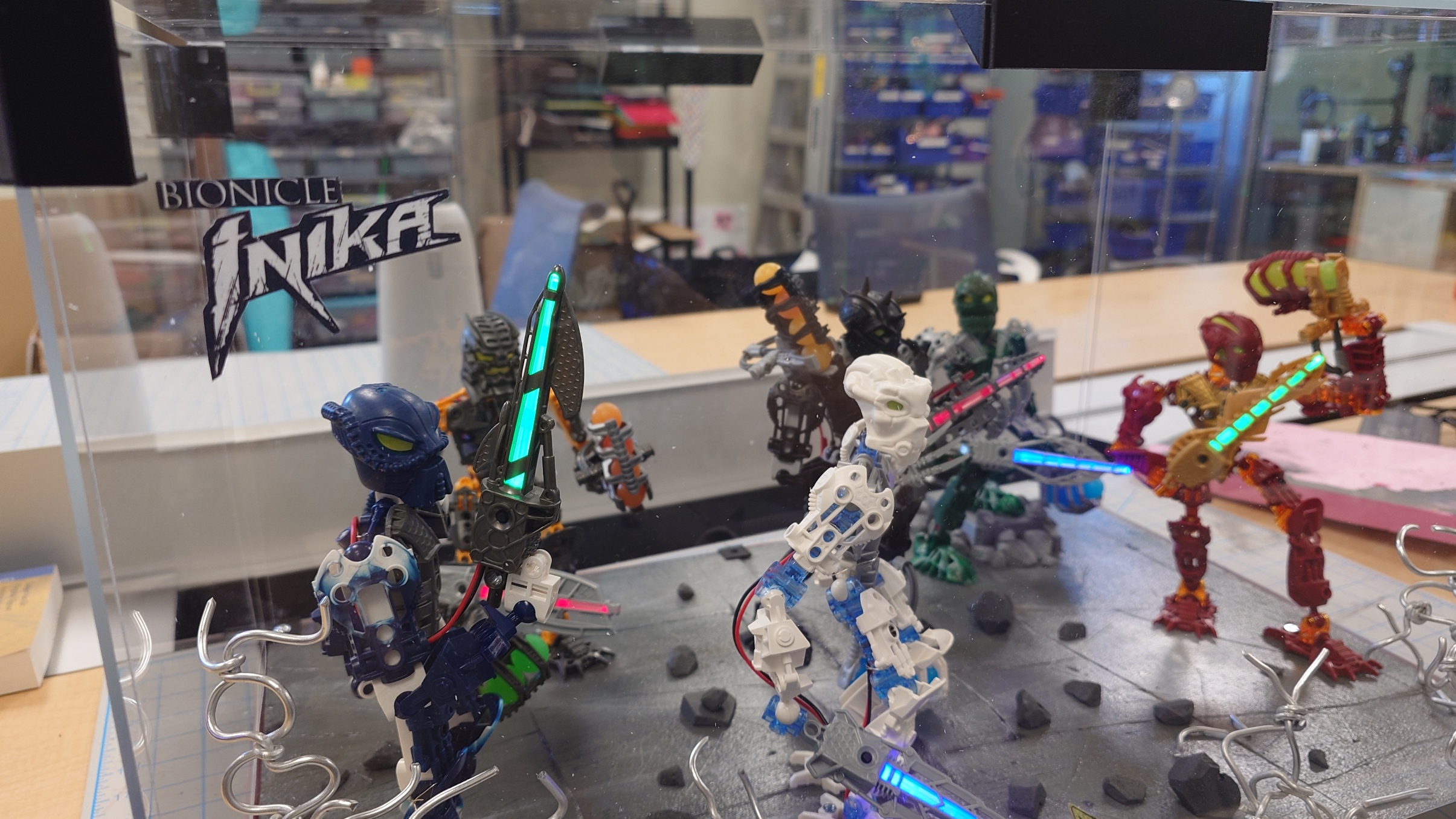
Bionicle Display Project Part 15 – Move Along
This is it, the final week. It’s been a long time coming, so let’s finish up with a bang. I’m really glad I finally get to use this title; I’ve been super excited for it.
Banners and Stickers
I went ahead and printed the sticker sheet I had, and used the Cricut that was available in the DKC (after getting the appropriate training for it) to cut them out, along with some extras just in case.
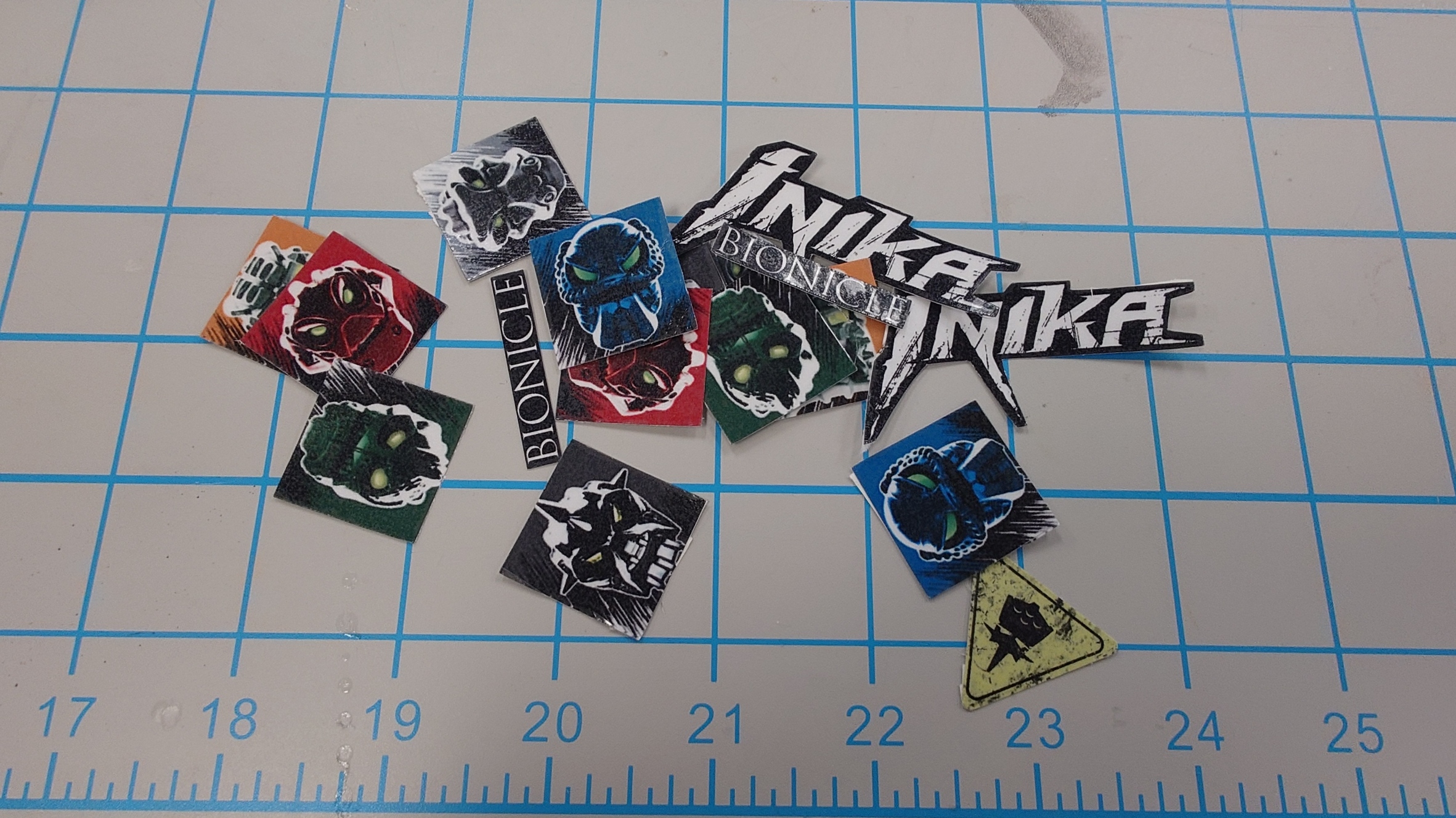
They turned out pretty good, but I still wanted the extras in case something messed up.
For most of these, I will still have to wait before I can use them, although for one of them, I can go ahead and get it added now.
I used some cardstock and cut an outline of the sticker, where I then simply placed the sticker on top of it, which gave me…
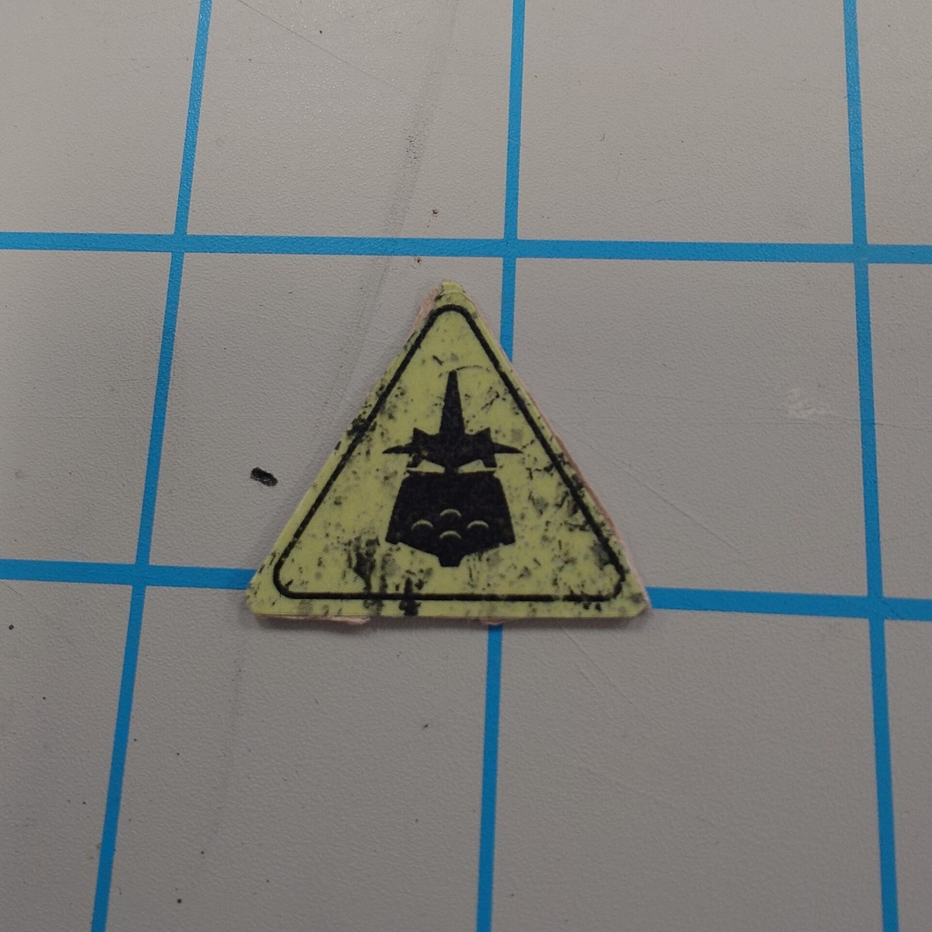
The weird Piraka hazard sign.
I personally think it almost looks exactly like a decal Lego would use officially, so I’m super proud of that.
But with this added thickness, I can easily just lay it down somewhere on the display base for that last bit of detail.
A Loss of Direction
It was about at this point that I started to get scatterbrained and distracted with other aspects of the project. I wanted to try out the Plexiglass to make sure it would fit, and try various methods to make it stick.
Originally, I started with magnets since I figured it would be easiest, but the DKC unfortunately did not have any that were strong enough to hold the Plexiglass in place, so I had to redesign.
After a short break, I came back to it and suddenly got hit with the idea to make a specialized holder that would slot the sheets into place. I sketched out the design, but I couldn’t figure out how I would make it attach to the platform raisers I already had.
I got stumped on it for a little bit, but after another short break, I got struck with inspiration again. Instead of making an entirely new part, I could just incorporate the design into my already existing platform raiser!
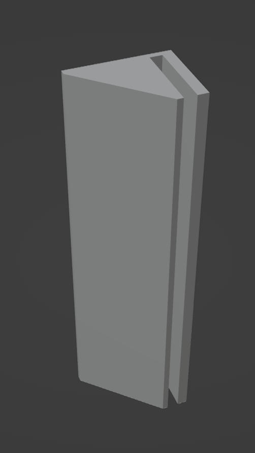
I quickly got to work in Blender, and created this (while also getting the hang of using proper modelling techniques! My model is no longer incredibly messy):
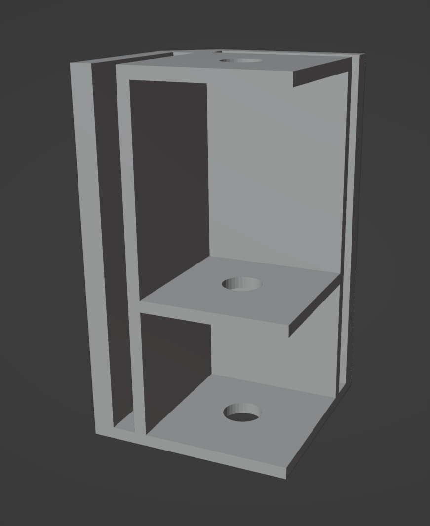
I didn’t realize it while making it, but this also keeps the profile super low and overall lightweight.
But while I set them out to print, I decided I would have time to go get the border trims printed as well, so I went out and got that done, courtesy of Cartland’s fancy glossy paper.
I’m more than satisfied with the results. The paper looks incredible, and I’m happy with my design overall.
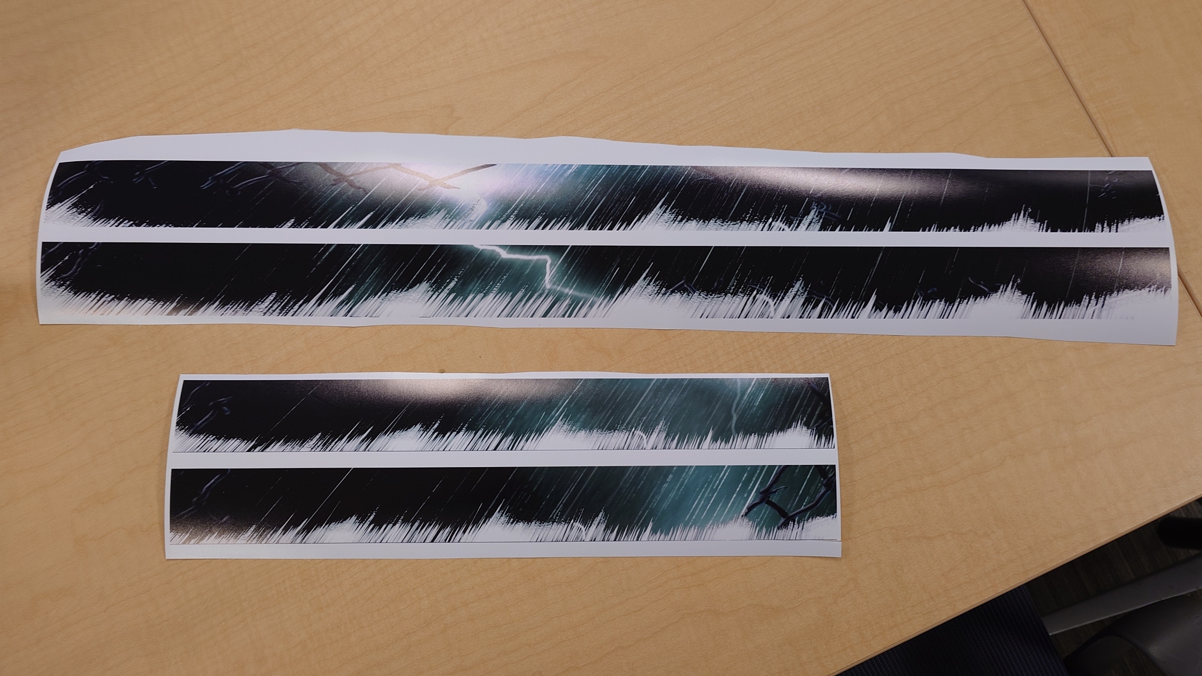
It’s a much higher quality paper than what’s used in stores for Lego’s banners (generally), which is perfect.
What isn’t perfect though is that I have to get these perfectly cut out without being able to rely entirely on the help of a paper cutter, since the longer strips don’t fit within the blade length.
I was able to get a good bit of them cut out by removing the bar on the paper cutter, and by going slow and careful with the blade, but I still reached a point where I needed to do it manually as the pieces just got too small for the blade.
I simply used a ruler and knife to line it up and cut it out. I did make a few mistakes, but nothing that was super-duper noticeable thankfully. It was a very tiring process however, and I much prefer cutting foam to this.
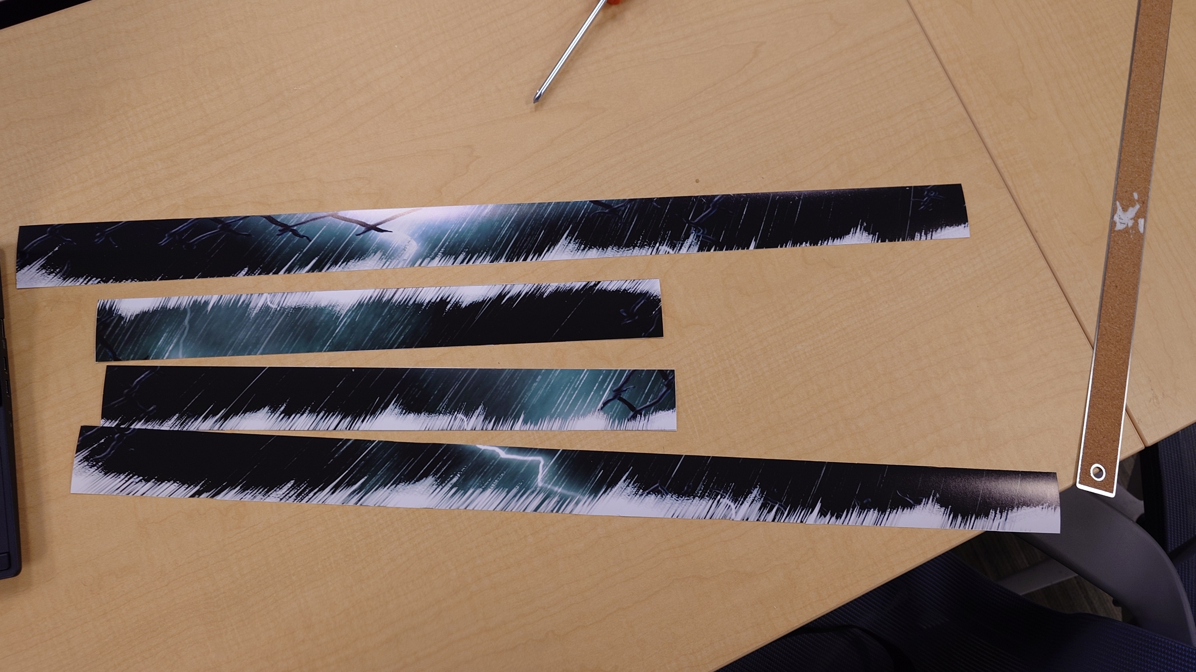
With those done though, I just need to wait for the new platform raisers to finish up.
A Proper Fit
Once they finished printing, it was easy enough to remove the bolts from the old ones and stick the news ones in. They fit just as well as the old ones did, as expected.
The next step is to apply the trims. I talked to Cartland for ideas on how to get it done, and he suggested using some glue, which I don’t think is a bad idea, but I had another one in mind to try out first.
I could easily slot the trims into the platform raisers alongside the plexiglass. It wouldn’t be very smooth, but I think I could make it work.
It isn’t perfect, but it is pretty good, and that’s fine enough for me.
Now, my original intention was to place the stickers directly on top of the trim so they would sit behind the plexiglass, but I don’t think they would’ve fit. The fit was already tight enough with just the trim and glass alone, and I think the added millimeter or so from the stickers would’ve made it impossible for it all to fit properly.
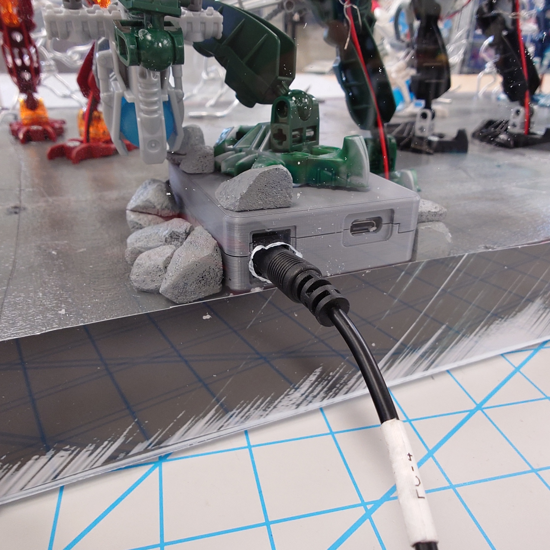
So instead I will have to place them on top of the plexiglass, which isn’t an issue, I just need to wait before I can do that, as I need to do some drilling.
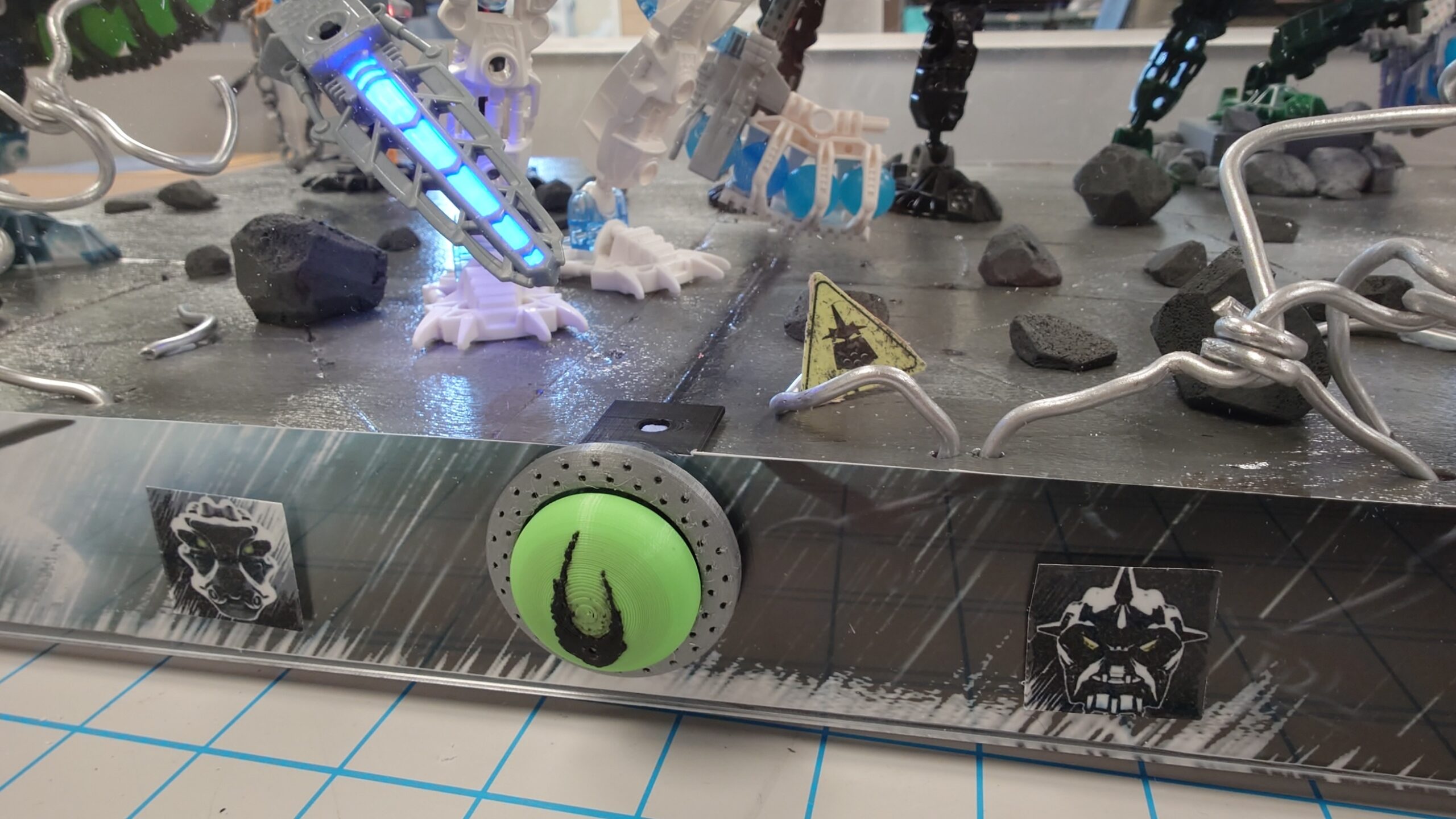
I need holes for both the button on the front, and the power supply in the back. One of those is going to be a lot easier than the other, but we carry on nonetheless.
I decided to start on the back since I could just use my hand drill to make the holes.
After a bit of work, it turned out messy, but functional.
So now I just need to do the same, but on the front.
I decided the easiest route would be to just cut a small square out that was the size of the switch for the button. It took a lot of finagling and a good chunk of time, but I eventually managed to come out with a result I was satisfied with.
And that, thankfully, marks the end of cutting into the plexiglass. It’s time to move on to the finishing touches.
Finishing the Fight
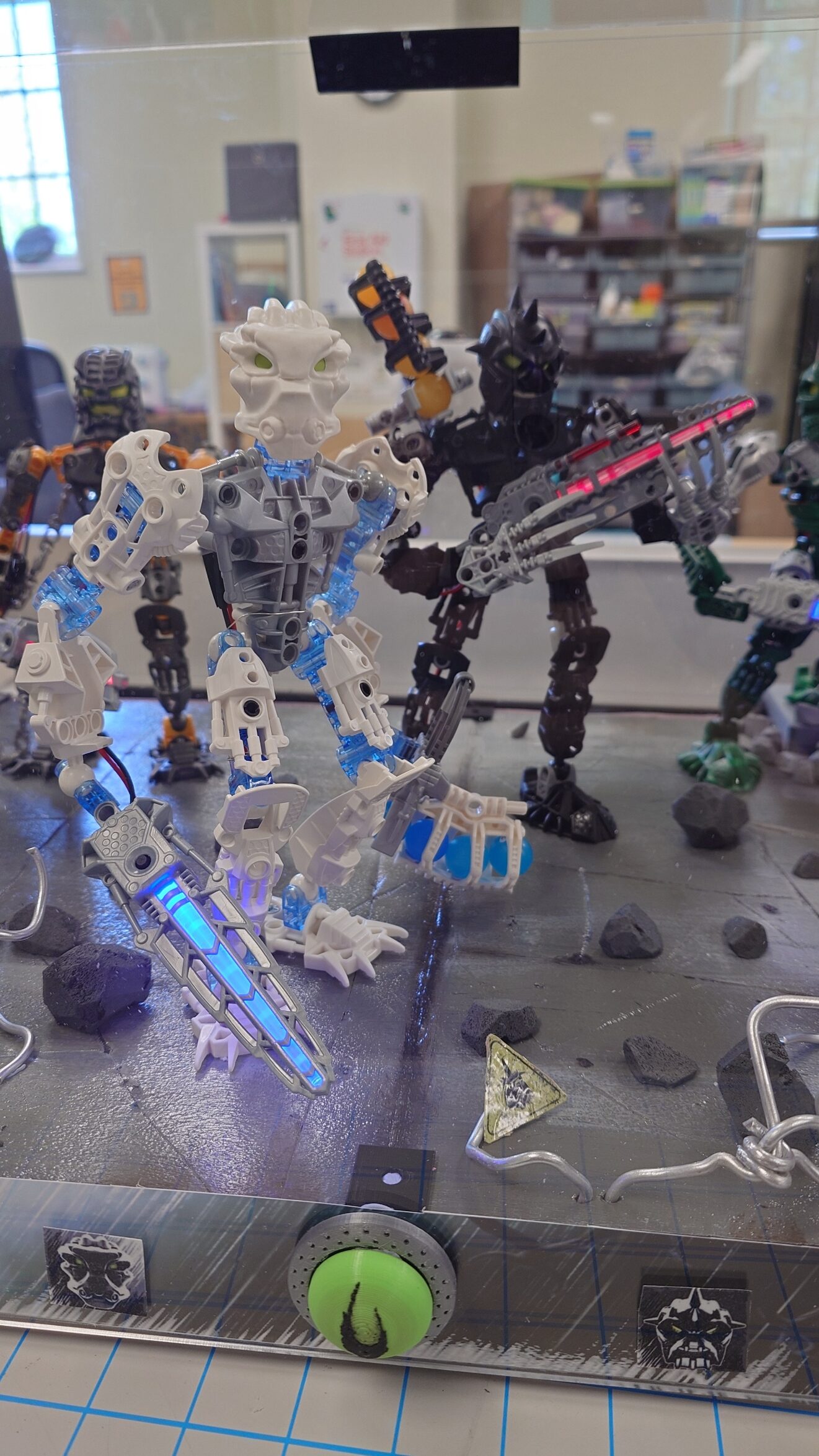
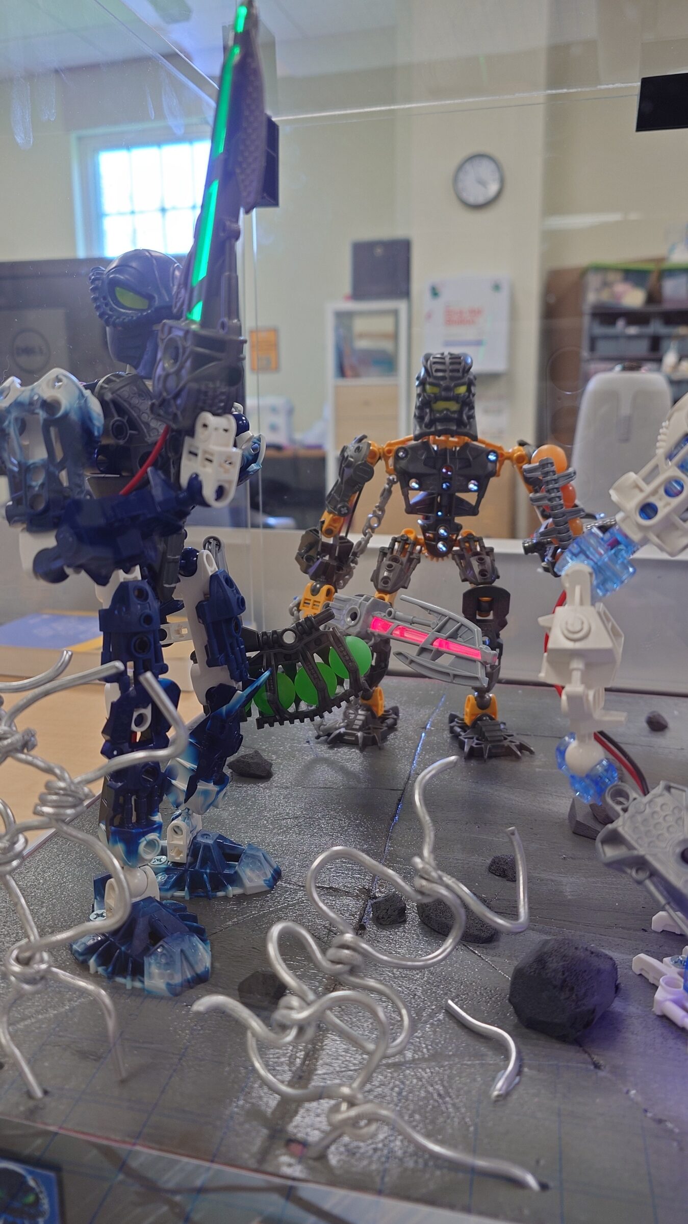
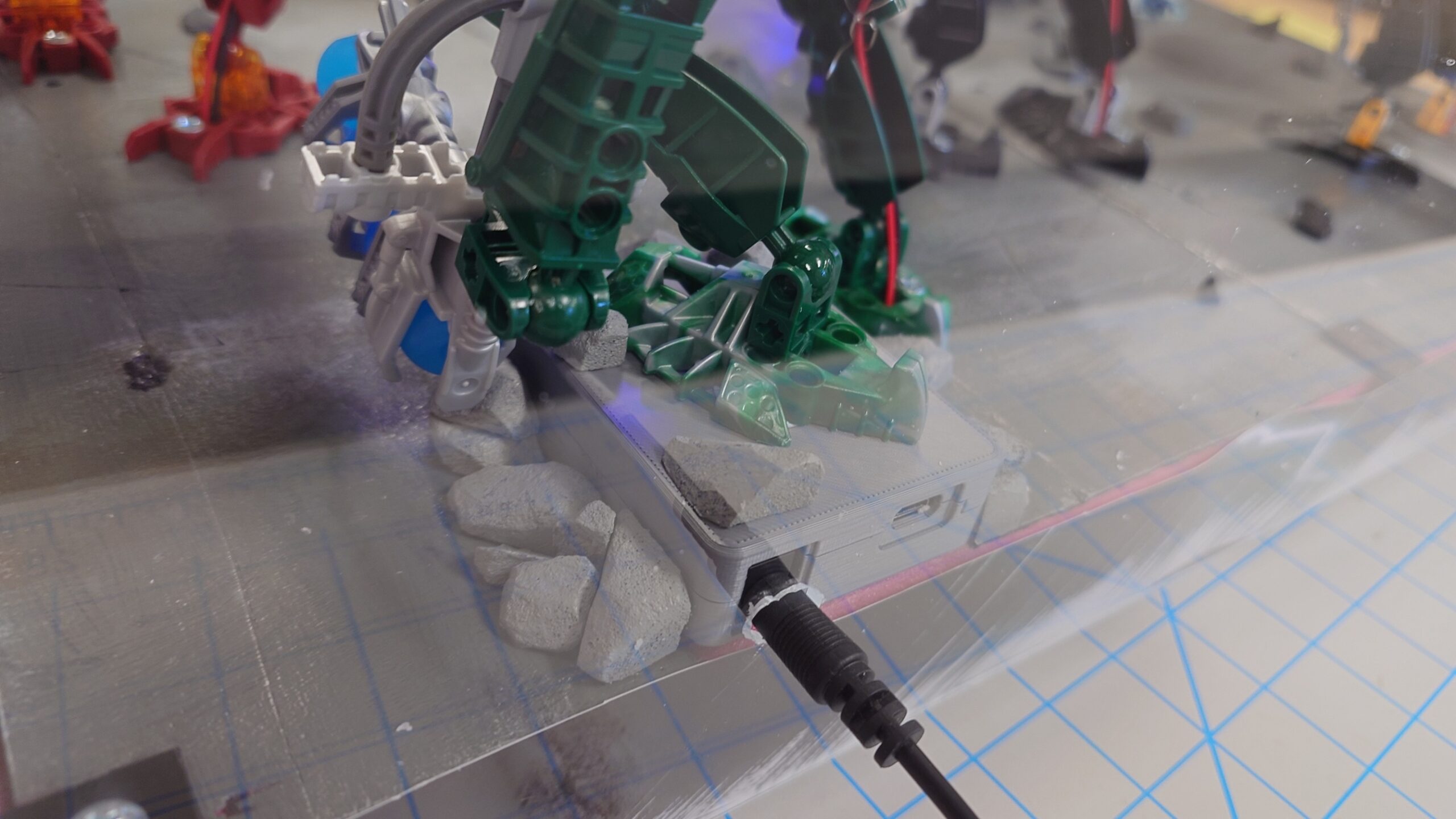
The first thing I did was add some rocks around the base to help it look more natural. I did a very quick cutting and painting job, but I think they turned out okay.
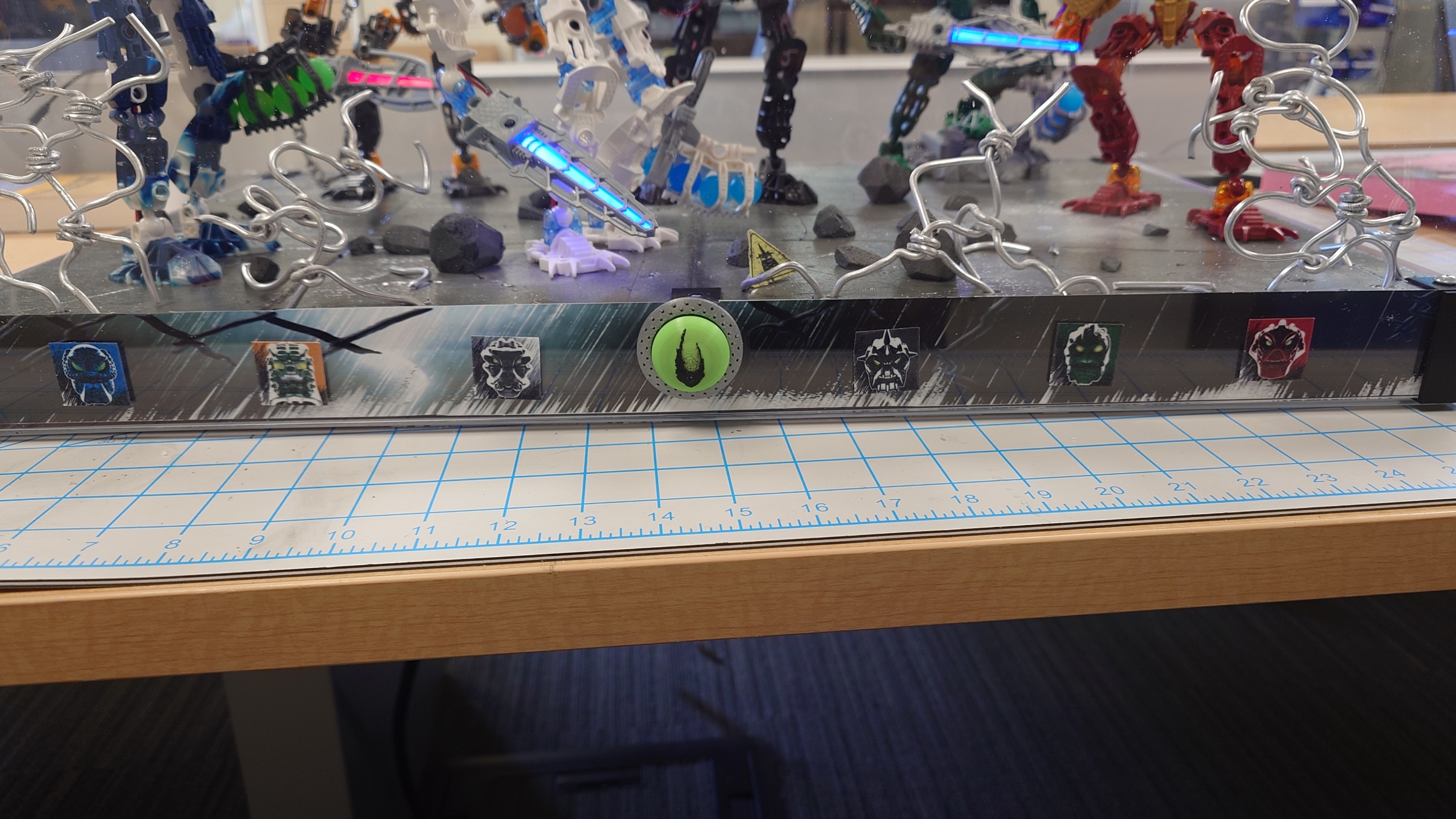
Next up was to apply the stickers. I decided on putting the logos in the top left, to mimic the actual canisters from the sets, but I was less sure about where I wanted to put the icons of the Toa.
On one hand, I originally wanted to place them on either side of the display, to help fill it out more, but I feel like it would leave the front too empty, especially with the button having to do all the work to fill it up. So considering that, I opted to place them on the front.
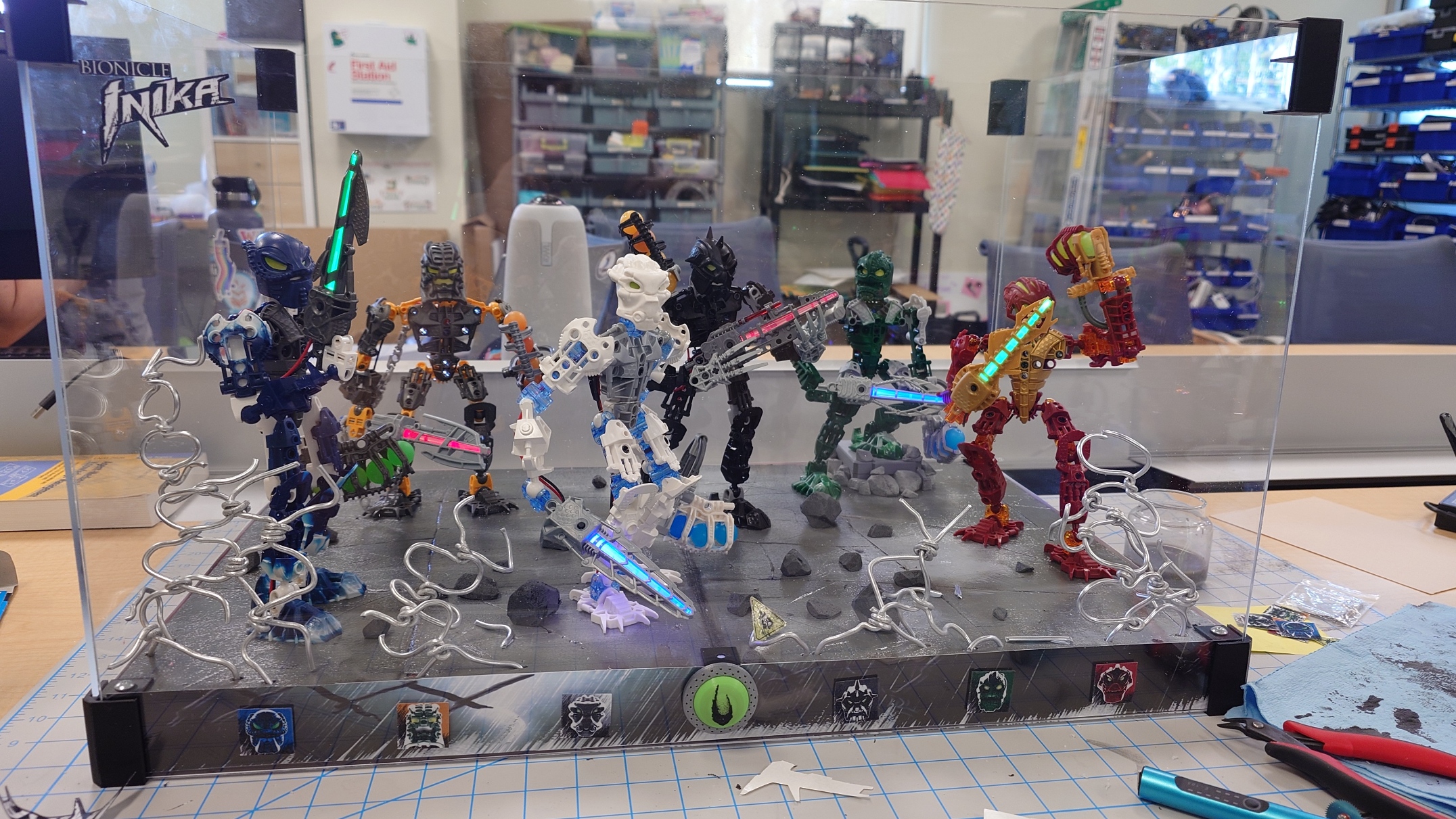
I definitely put some of the icons on a bit crooked, but hopefully it won’t bother me too much. I don’t have a lot of time to spare to reprint unless I absolutely need to.
With these small additions, that leaves the last task left: put the lid and bottom on and seal it all up!
Sealant
As I was measuring the sheets, I realized I will need a bit of extra support, as the plexiglass on the top dips down slightly, and it concerns me enough to do something about it.
To this end, I pulled up my platform raiser model in Blender again and tried to work off of that. My idea was to essentially take the raiser I have now, and translate the design to be on its side.
The print was going to take a while, so in the meantime I started working on cleaning up all of my various supplies I’ve accrued over the last few months. It’s been a very fast semester, I feel like. But I’ll save the retrospective for the end of this post.
As soon as the helpers finished printing, I went ahead and tried to screw the plexiglass on. This came to a very quick halt as soon as I cracked it.
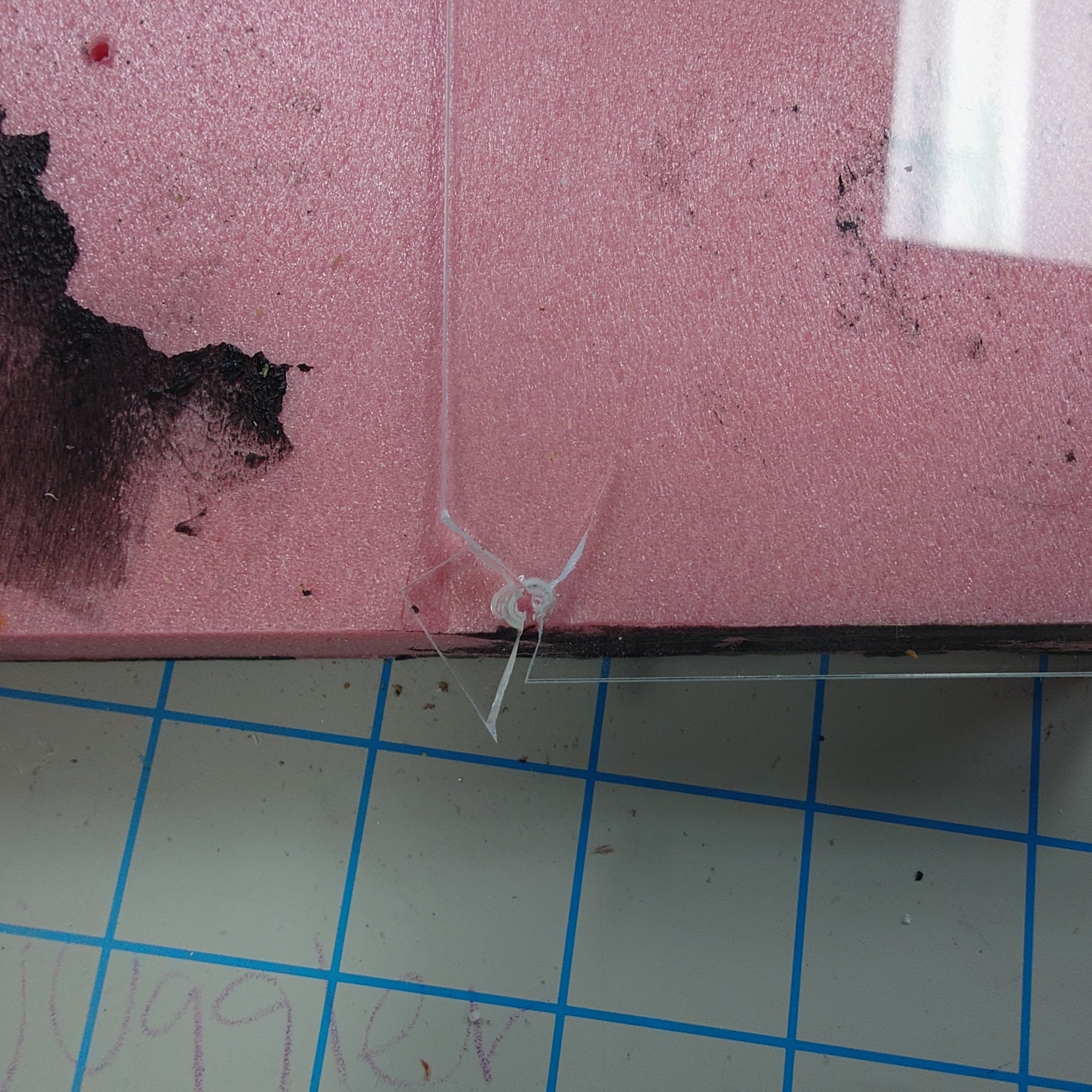
I was a bit upset, but I quickly thought back to when I did my research on this. The threat of cracking the acrylic glass was very high, and something that was always warned about. And yet I managed to forget it.
This scared me off from trying to screw anything else into it, and I immediately went back to the old reliable Blu Tack to keep the panels in place.
It’s not the prettiest solution, but I don’t have any time to brainstorm about it now.
But with those panels put on, it’s finally time to come to a close here.
Journey’s End
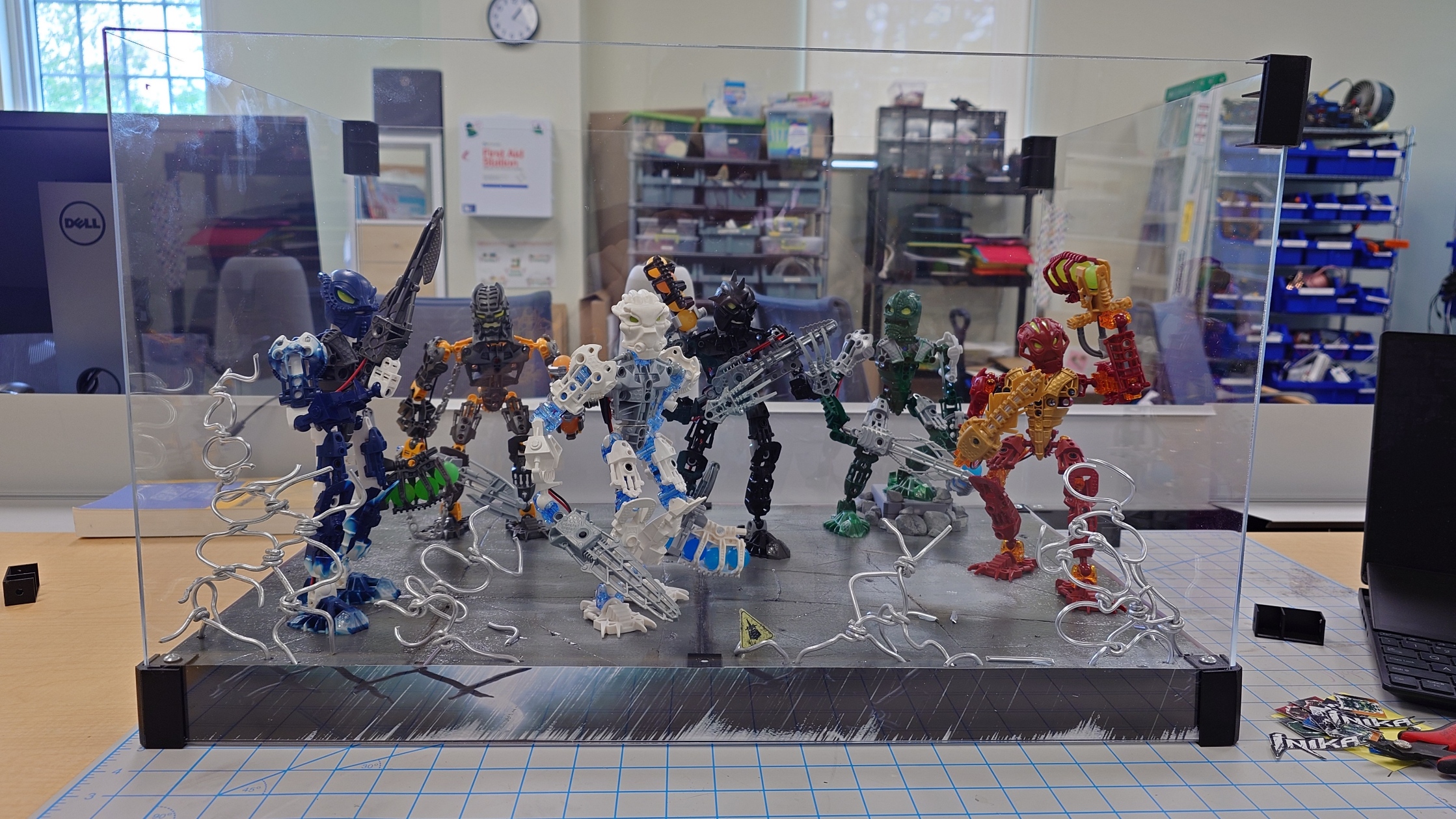
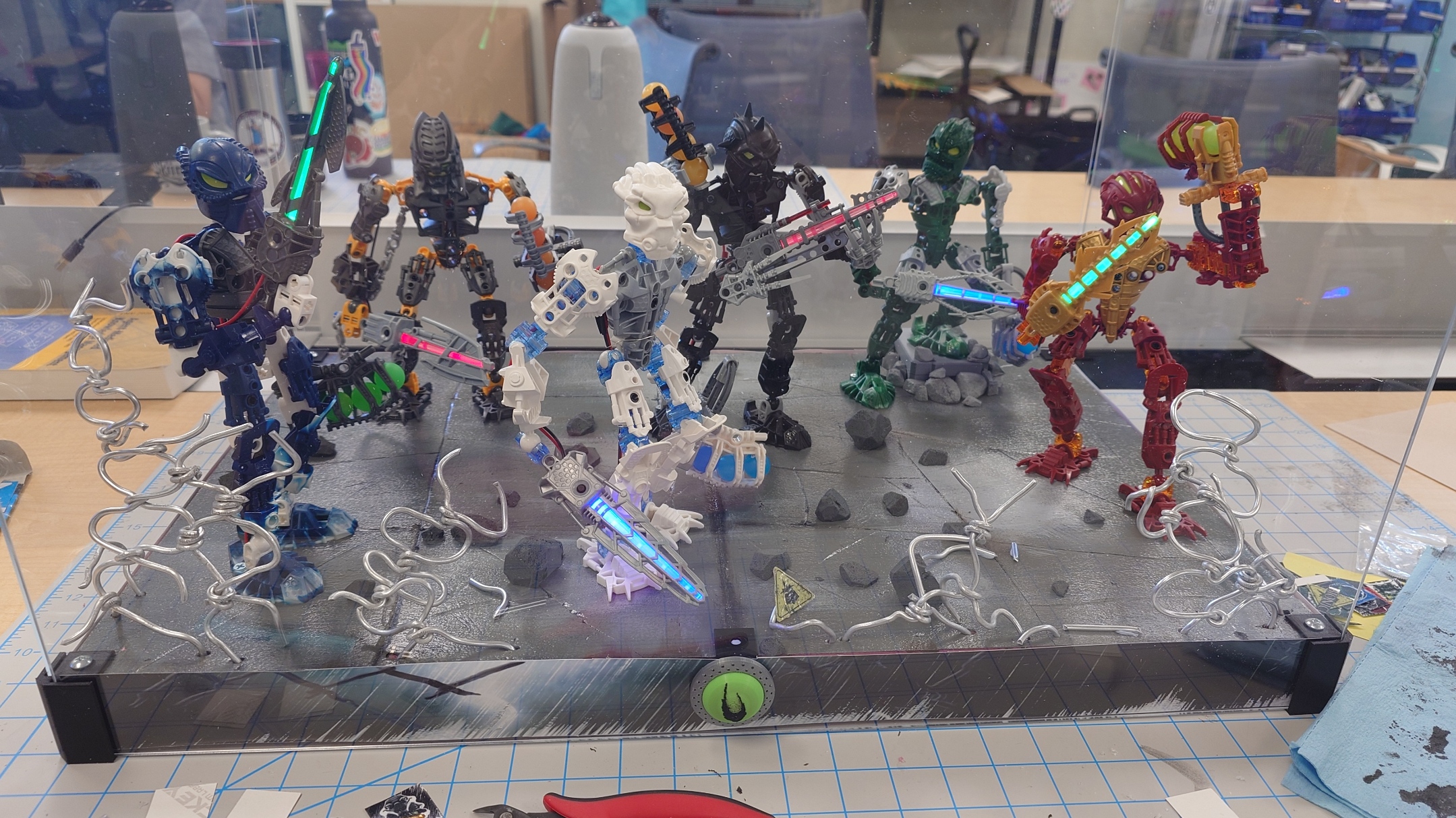
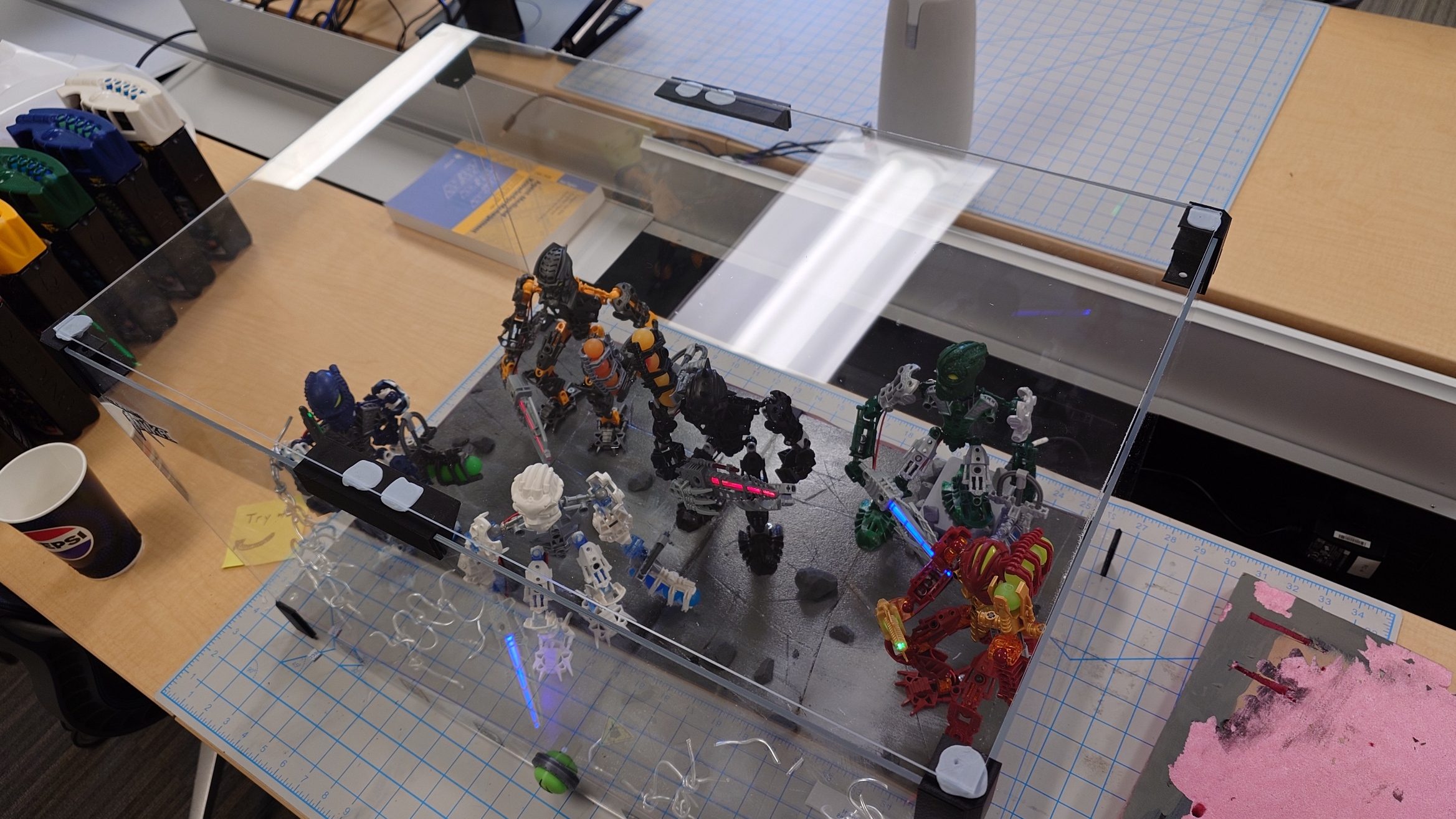
Shannon requested that I get “as many pictures of the completed project as I can”, so I’ll abide to that request now.
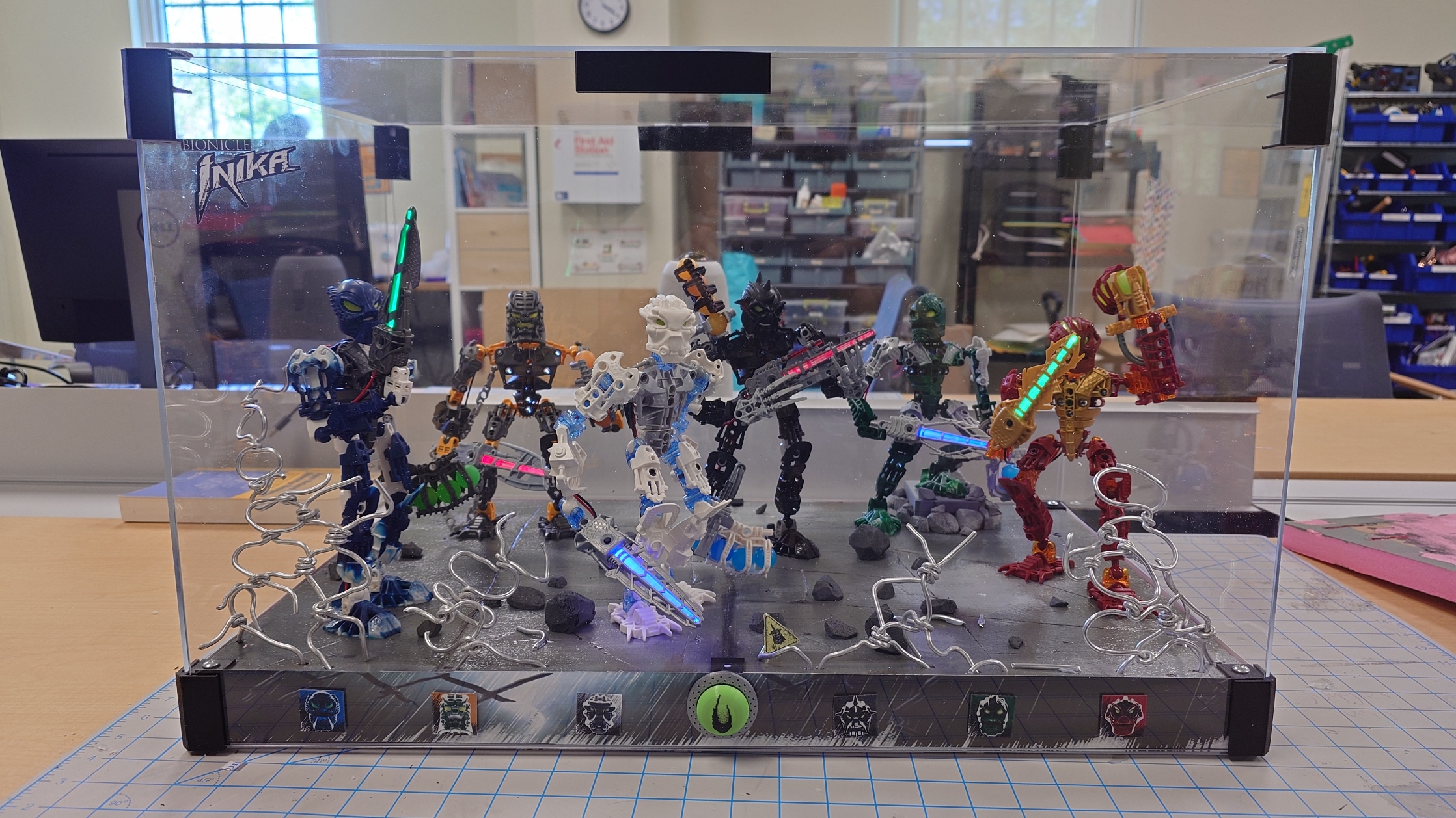
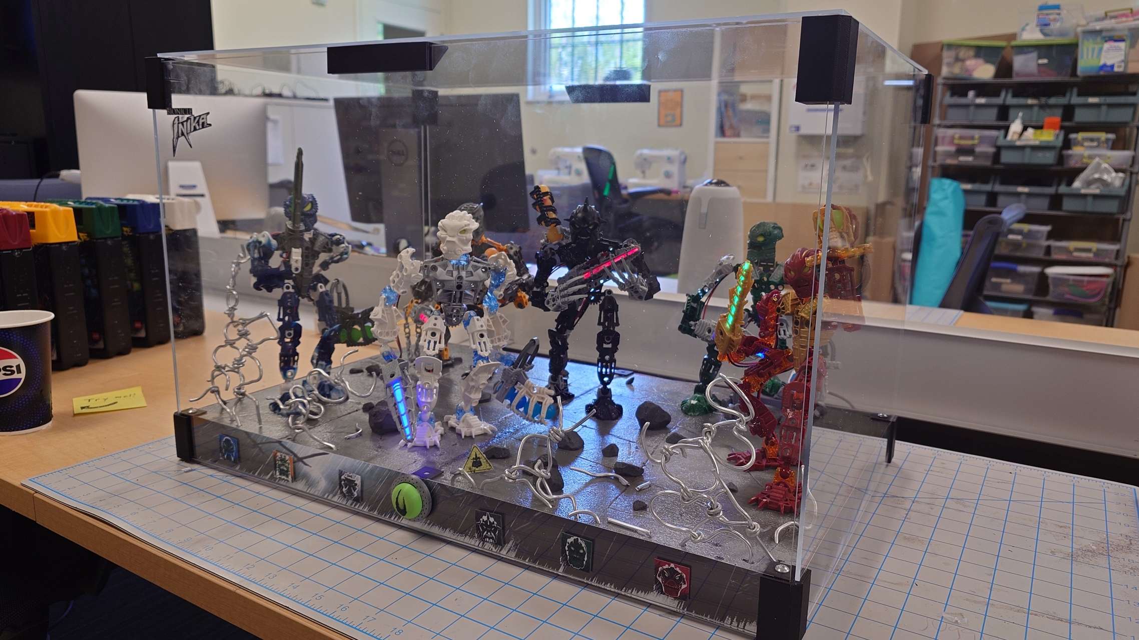
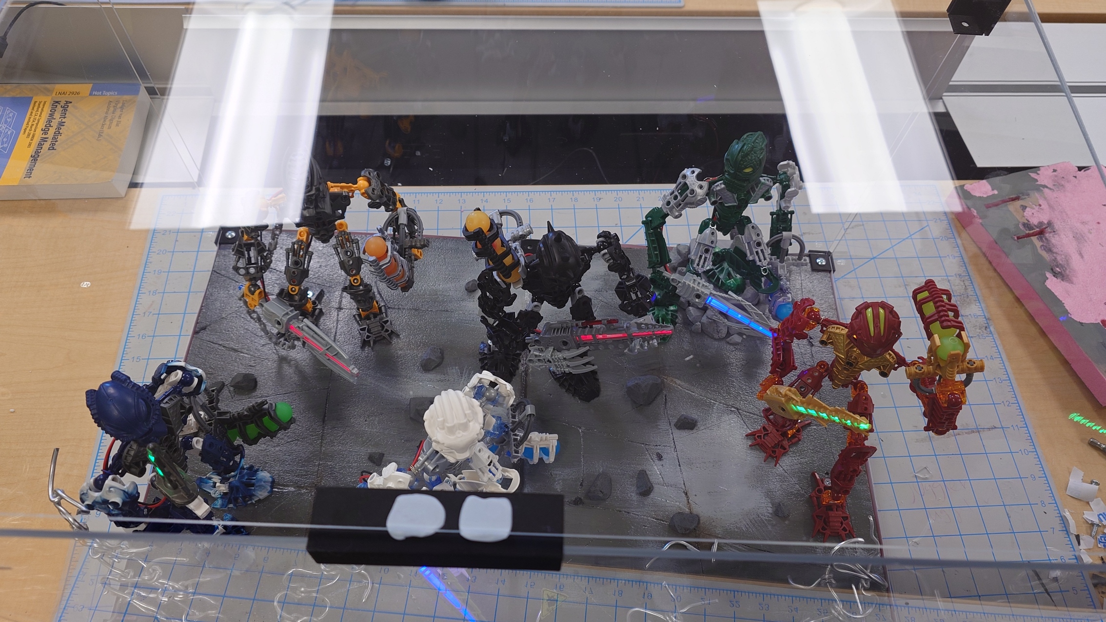
And of course, it’s time for the big function reveal, at long last. These lights have been working for a good few weeks now, so it’s time to finally show them off.

And with that, it’s time for a retrospective.
Like I said before, it’s been a fast few months. Spring semesters typically are though. This project was both a lot of fun, and also really tedious to do. I, rather surprisingly, didn’t make as many compromises as I figured I would, but maybe I just don’t realize them.
While I did mostly enjoy writing these blog posts, the novelty started to wear off in the last three weeks or so, and it became a chore. I do wish I had more fun facts to bring up, but I was limited by trying to keep the facts related to what I was talking about, which means I couldn’t do very many when all I got to talk about was the process of how I created stuff.
I know I’ll come to regret having so little details about some of my processes in the future, but hopefully by then we’ll have tools to extract memories from our brains, or something like that.
Being in the DKC this long has essentially turned it into home for me. If it weren’t for weekends, I probably would’ve spent more time here than my actual home. I liked getting to talk with Shannon and Cartland so often (and Jerry too, even if our interactions were brief), and I’m glad to have bonded more with all of them. It was also interesting seeing all of the people that came in throughout the days.
It’s funny thinking back to one of my meetings with Shannon and Cartland where I expressed worry about finishing this project too soon in the semester, as I sit here writing this only one and a half hour before the DKC officially closes… on the very last day of the semester. It quite literally took me every second.
I definitely could’ve been more efficient, but that’s just how I am. Some weeks were destined to be slower than others. But in the end, even only missing two days and leaving early only a handful of times, I managed to complete it.
I definitely wouldn’t mind doing another one of these, but I’ll need more time and definitely more money, which is scarce for me currently. But if I did do another one, I’m stuck between doing a single tube-style one for Toa Jovan, or doing a full display like this for the Piraka. Only time will tell if I do either.
I think that’s about everything on my mind regarding this. I know I’ll remember something else a week later, but oh well.
Throughout completing my duty in this process, I’ve gathered unity, and now it’s time I continue towards my destiny. There’s no better way to end this off, than with one of the final quotes spoken in Bionicle:
“All journeys must come to an end, but this time, there is a new beginning as well. There will be challenges to face and enemies to fight, but I know you will overcome. All that has gone before, my friends, has only served to give birth to this new day.
Let unity, duty and destiny be your guides. Be well, be strong, care for this world and for each other. Farewell.”
– Mata Nui, Journey’s End
My friends, it is time to go.
-
Bionicle Display Project Part 14 – One Final Effort
Week 14… It’s the end game now. Once again, no time to waste, so let’s get started.
A Bit Here and There
Last week we left off with some button business needing to be finished up. All I need to do is first print a test design to make sure I have the measurements correct, and then go ahead and print the final product once I have confirmed that.
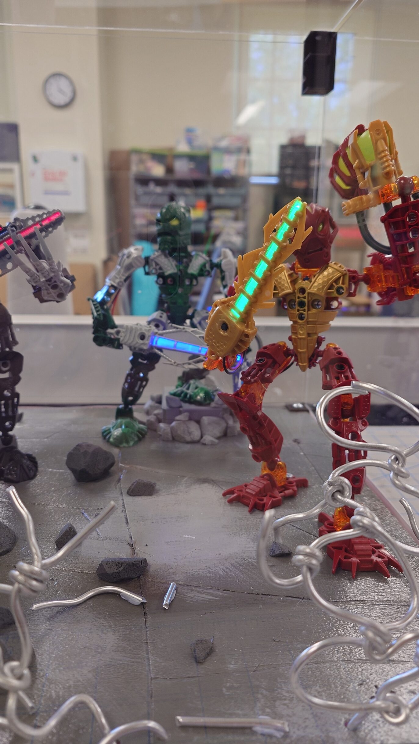
While it printed, I decided that it was finally time to put a few things in place, starting with Kongu and the Arduino board.
It ended up being a bit of a hassle to connect the cables, and I had a few of them break off from the circuit board that I needed to resolder, but eventually I managed to get it all set in place. The next thing I did was screw the circuit board on to the underside of the foam, which really helped with the cable management issues.
And then I went ahead and finally attached the rocks, and a bit of extra pieces of the chain-link fence for more decoration.
Adding all of those changes together gave me this result:
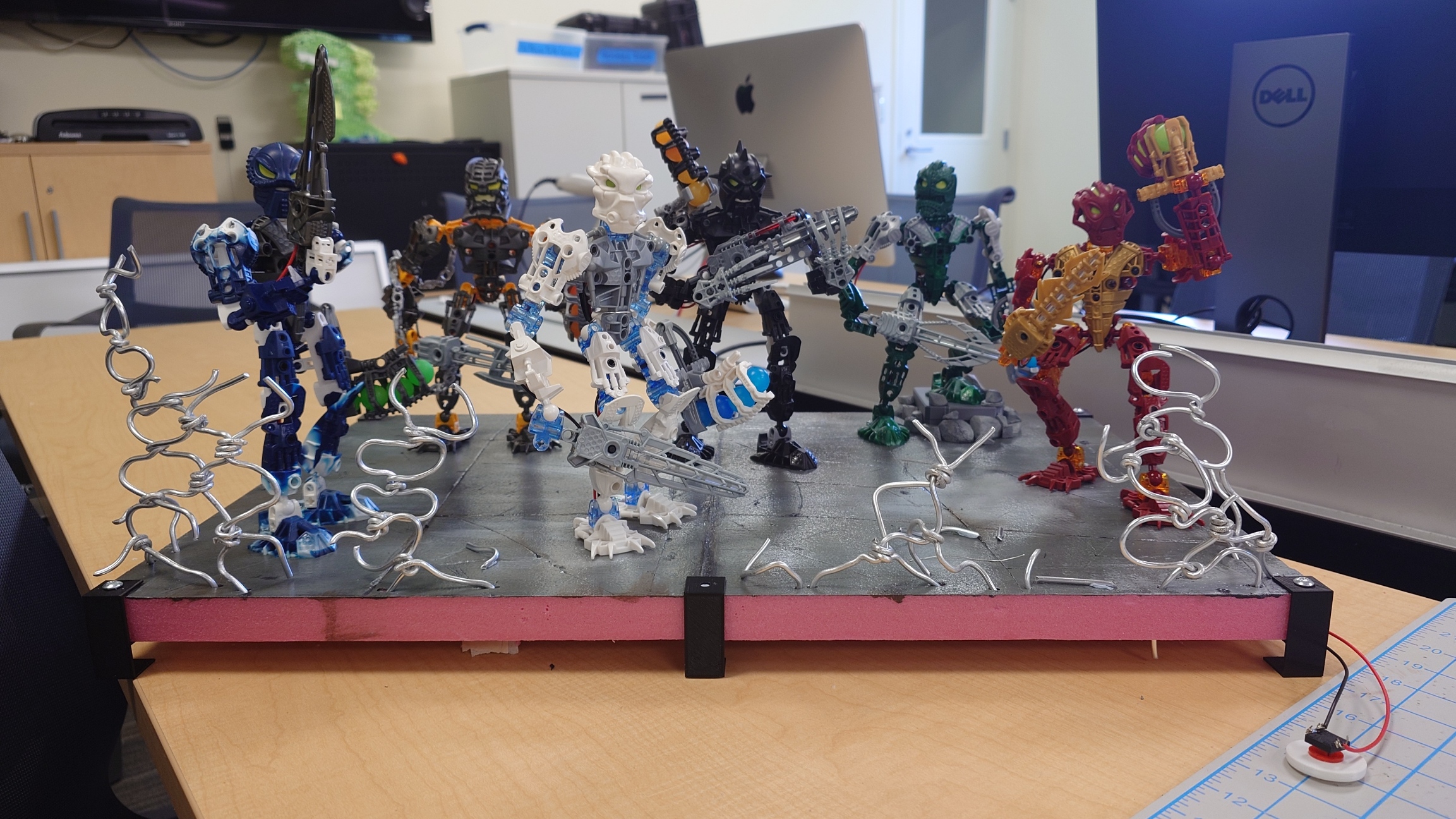
They’re finally starting to look like a true Toa team.
I’ll definitely want to carve some extra rocks to scatter around the base some more, but I’ll save that for last so it doesn’t cut into my valuable time.
But with that said, the next thing to work on is the decal, at long last.
Retro Fashion
I got the measurements set up in Photoshop, and while I have a general idea of what I want to achieve for the decals, I wanted to make sure I did it 100% correctly. And thankfully, I didn’t have to do it by eye alone.
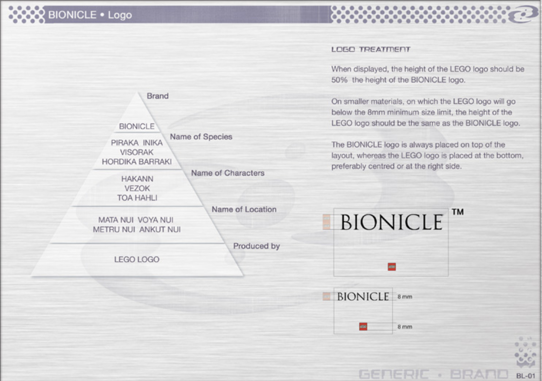
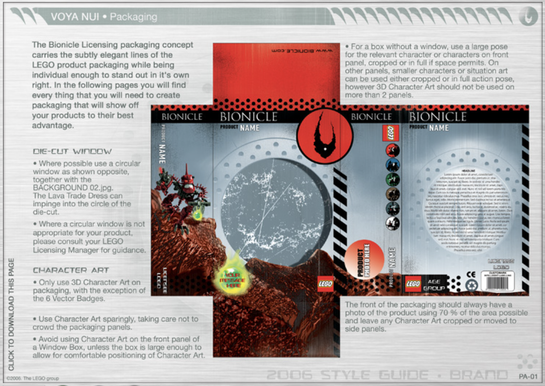
One website I frequent is the BioMediaProject.com (currently in the process of moving to MaskofDestiny.com), home to all things Bionicle. From archives of the original Flash and retail games to specific marketing materials only meant to be seen by Lego employees, it’s an absolute haven for people like me.
Part of these archives includes some of the style guides that were used by Lego and companies it outsourced to, to make sure their branding stayed consistent. One for each year, save for 2002 and 2010, the years 2006-2008 are grouped together in a special “e-style guide” (found here) that unfortunately runs off of Flash, which made it somewhat of a pain to open.
Nonetheless, using an emulator, I was able to view the contents inside. Included were the specific guides for the years of 2006, 2007, and 2008, along with a general introduction to both the story during the time period, and also a general guide to Bionicle itself.
There’s too much specifics to go over here, so I do highly recommend taking a look at it for yourself. For the purposes of this project though, these are some of the pages that will serve the most useful to me:
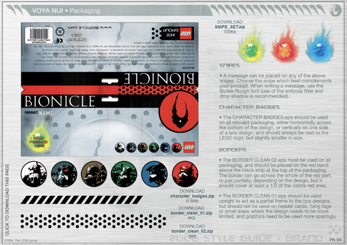
Unfortunately, all of the downloadable content linked in these images are lost, for the most part, but there are other ways to get some of them, either through recreating them myself, or by taking other Photoshop files that contain the assets.
This is also not everything that I will be relying on, it’s simply the most interesting parts of the guide. Beyond the guide itself, I also have the physical canisters with me that I can reference. No better of a guide than what was officially released, after all.
But with this all gathered, I took some time to begin work on the display banner.
While creating it, I decided that, instead of trying to measure everything constantly and make sure none of the logos or icons go somewhere I don’t want them to, it would be much easier to print out the background on its own, and then print out any extra decals I want as stickers! Following this pathway made it much, much easier for me to create it all.
I first got the background that would host everything I wanted, which I decided to model after the background on the Inika canisters and promotional material:
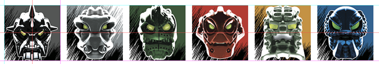
From there, I created a new canvas to host all of my sticker designs. I started by adding the Toa Inika icons that I’ve always loved:
I also wanted to add both the Inika and Bionicle logo to the display. The Bionicle logo was easy enough, even though BioMediaProject didn’t have the specific one used in 2006, the biosector01 wiki did. For the Inika logo though, I wanted to use the same one from the canisters. On the design document, it has the “Scratched Outline” label.
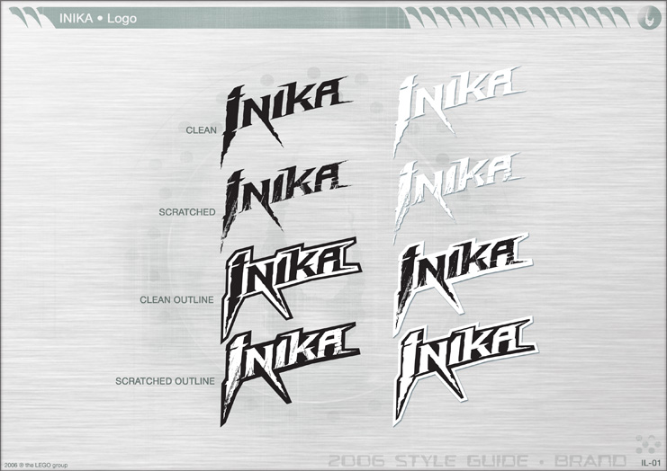
However, it wasn’t so straightforward. I thought that BioMediaProject would have it, and that would be the end of it, but strangely, the only Inika logo they host is the “Clean” one from above, not outlines, no scratches.
And as I said before, all of the download links in the design documents are broken, so no luck there. I got a bit desperate, so I just kept trying to search to see if anywhere else hosted the files from it, but there was still nothing. I did, however, come across biosector01 again though, and amazingly, they had a high-quality version of the “Scratched” version of the logo.
I was baffled, nowhere else had the logo in such a high quality, so I honestly have no clue where it came from, but I’m very thankful for it. My job wasn’t over though, as I needed the outline, partially for styling reasons, and partially because the sticker paper can’t print transparent parts.
I tried using the “Stroke” modifier in Photoshop, but it didn’t give me the same results as the official logo, so instead of trying to make it work, I just traced the outline with the pen tool and made it fit the logo I had.
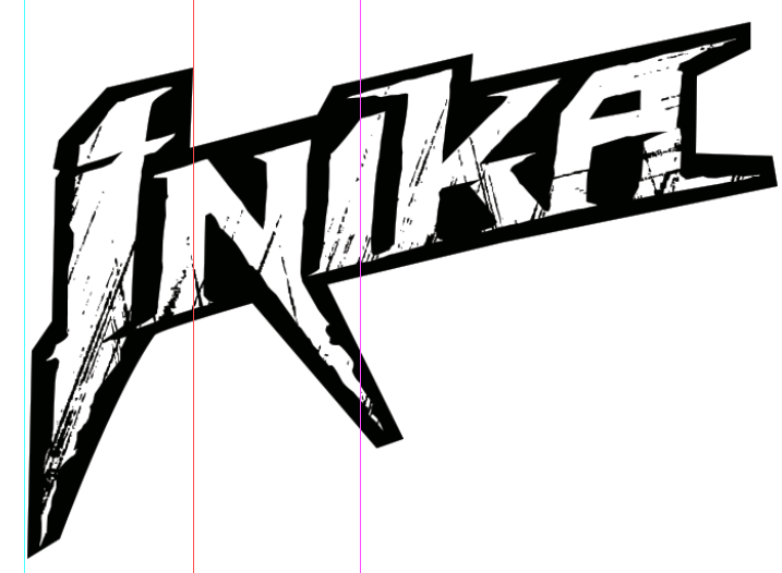
It’s pretty close, but there are very minor imperfections, that do bother me. But I’m willing to leave a bit of errors, since it won’t be super big anyway.
While working on the stickers, I had another idea of something I wanted to add. The Piraka hazard sign from the commercial!
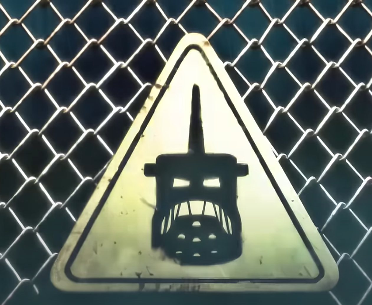
It’s a little goofy, because who could this possibly be for, who could’ve put this up? Maybe the Piraka just want to mark their territory that much more. Regardless, I think having this sign be a part of all the broken fences would be a really nice detail, so I got to work.
I knew I would have to recreate this one, as there’s no way the original texture would just be floating around online, at least easily. The triangle and its outline were easy enough to do in Photoshop, but the Piraka head itself was a bit tricky.
It is very clearly a silhouette of Vezok, but there’s no icon that looks like it. Some of the Piraka icons are pretty abstract (how is Hakann’s symbol a representation of him?), and while Vezok and Thok’s symbols look similar, neither one shows their teeth like in the commercial.
This tells me that the sign was custom made, but it’s no issue. I decided that just using Vezok’s icon as is will still looks pretty good, so I made the following:
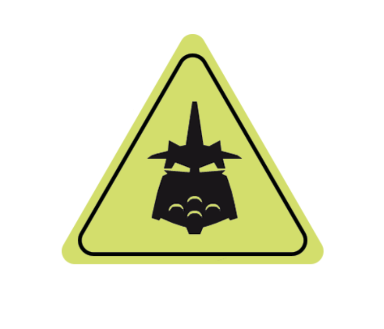
I could probably add teeth in, but I’ll do that only if I really don’t like this design.
Nonetheless, I’m still not done with this sign. It’s much too clean, especially since it’ll have just been attacked and blasted off of its fence, so I remedied that with some basic dirt and scratch textures.
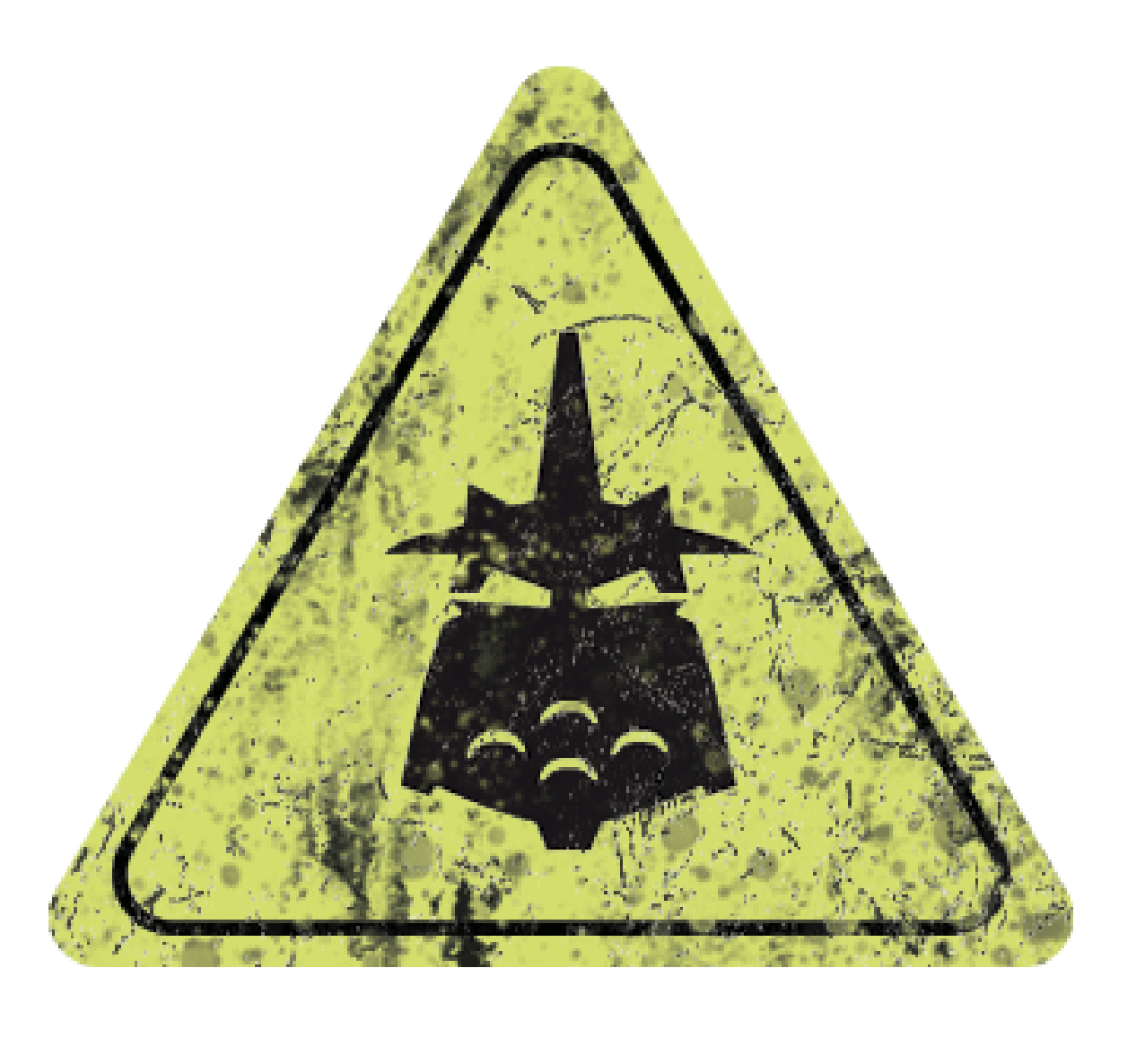
It’s got a lot more going on than the sign in the commercial, and I think it’s a bit cluttered, but it’s still recognizable, which is all that matters for me.
With all of this together, I’m ready to print on paper, but there’s something to attend to first.
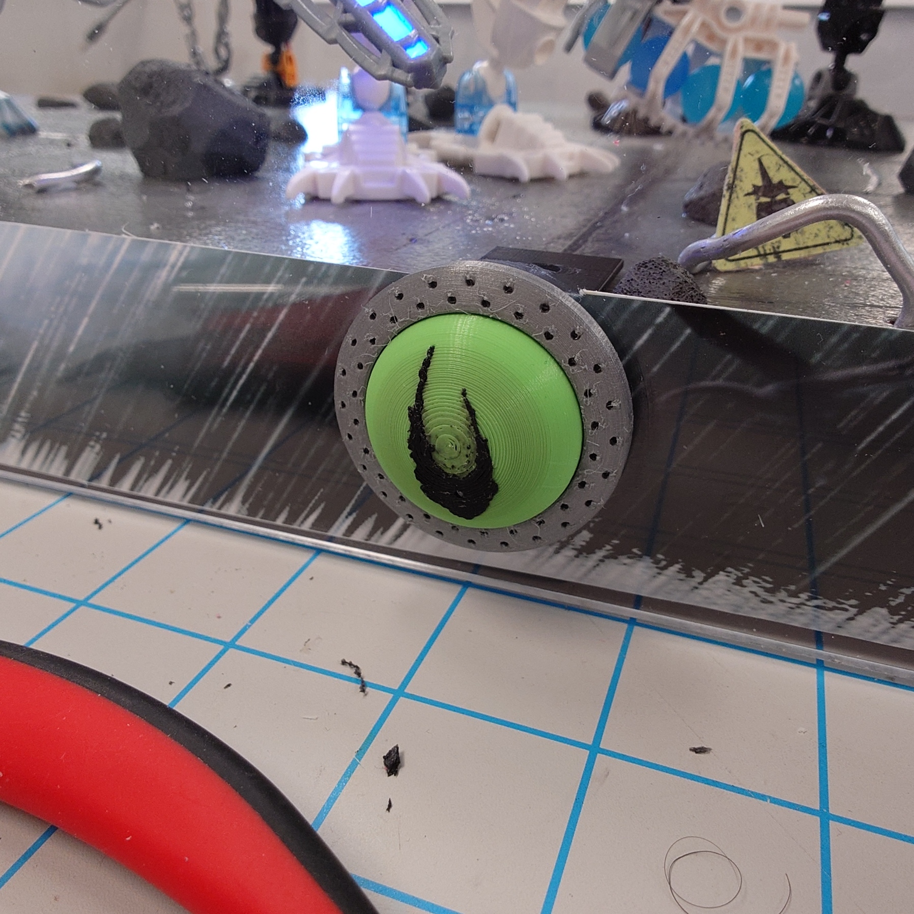
Pushing Buttons
It’s taken me so long to do all of this that my brand new button has been sitting around for a while! It’s time to show it off.
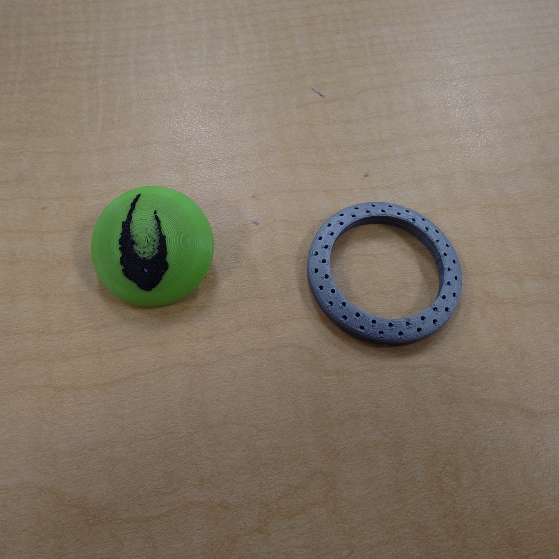
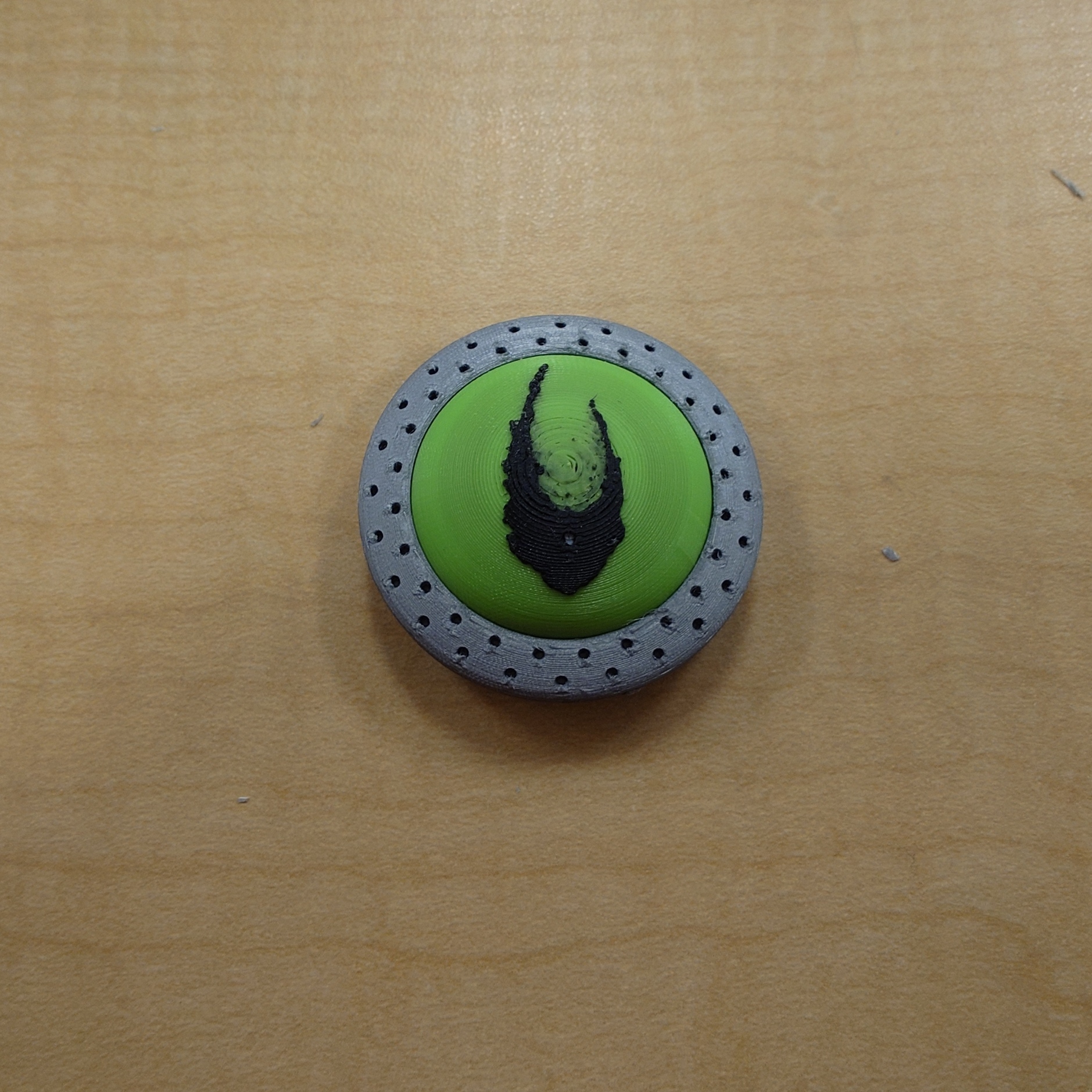
Unfortunately, the process was not perfect for the Voya Nui icon. There is a lot of black mixed into the green in the center, something I cannot clean up at all. The ring also suffered from some very odd issues, probably due to it being so small, and me printing it with a very, very high detail level.
I don’t really want to reprint either of these. They’re not unusable, and trying to print the bubble again is just priming for more headaches and issues. Perhaps if I have extra time. Either way, my measurements were absolutely perfect. So perfect, that I actually cannot remove the button on the backside of the bubble without a tool, and some force.
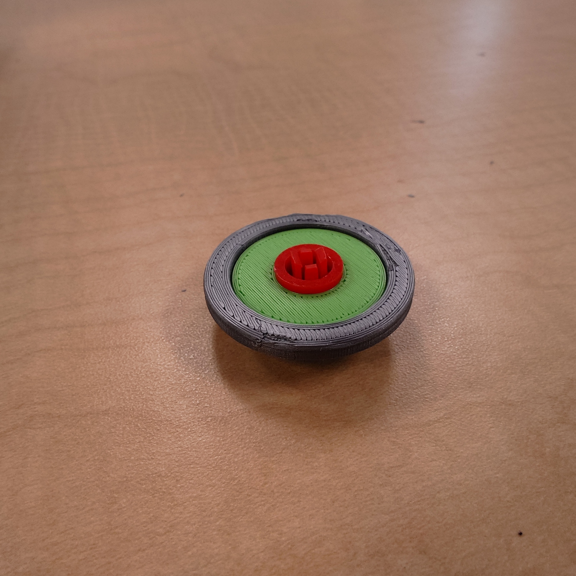
Thankfully, this is exactly what I wanted, so no issue there.
With the button complete now, there’s only a few more steps left to go.
One Minute to Midnight
However it will have to wait, as I am out of time for this week. I ended up being very busy and did not work on what I wanted to as much as I needed, so I am a bit behind now. But thankfully, not by much.
From here, all that’s left to do is print the decal and stickers, and then I can start putting the Plexiglass on, and making any final touches I need. It’s been a long journey, and I’m ready for it to be over.
That being said though, there are a few things I’d like to do if I have extra time. First, of course, is adding more debris around the base, as it’s much to clean right now, and scattering some extra rocks can really help sell the illusion. I’d also like to secure the platform raisers, as while they will work, they’re very loose right now and don’t sell the idea that this was made by a professional very well. Beyond that, I may reprint the button if I can’t stand it, and I may also end up adding more decals and stickers as I go.
For now though, I need to rest and prepare for my finals next week!
-
06 Almost There
The last couple of weeks have seen multiple rounds of iteration over my code and a few realizations on how a better structure could have been had from the beginning.
The first big thing change was the move from circles to ellipses, this took me a while. Turns out, there is a delightful bit of math for tracing the path of an ellipse called the parametric ellipse equation, this takes a parameter, theta (t in this case), an angle between 0 and tau (two * pi), and outputs an x and y value for the circumference of the ellipse at that angle. This plugs into code very simply and allowed me to stretch my orbits to better fit a non-square display.
Below is the note I have written for myself in the code. It includes a link to the site I used to learn this.
Parametric equation of an ellipse

x = cx + a * cos(t)
y = cy + b * sin(t)

t = angle parameter, from 0 to Tau (2 PI)
cos(t) = x component
sin(t) = y component

a & b = scale value for eccentricity
cx & cy = offset for center point

Source: Math Open Ref - Parametric Ellipse
With that addition came the challenge of mixing and matching equations. Previously I have been using a p5.js function, arc() to draw the orbits of the planets and fill in the portion of the orbit that they have completed. This also takes the parameters of an ellipse, but this function calculates angle differently. So my orbit fell out of sync with my planet, except at quarter PI intervals. Instead I have switched to drawing the whole orbit, and changing the fill value over time to indicate when an orbit has been completed.
While adding this functionality and preparing an output of my piece for the HCC Media Wall, I stumbled upon a very simple method for creating a “film grain” effect, simply drawing random points with a slight fade every frame, I am unsure if I will use it for my final piece, but it was a neat find.
Below is an export of my piece as I have it being shown on the HCC wall (except rotated 90 degrees).
After that I have been playing around with adding text, I greatly enjoyed seeing the work of Ryoji Ikeda at the High Museum in Atlanta in March. His exhibition, data-verse was, perhaps, the greatest thing I have ever seen in a museum, and I loved the way he uses data and text in his work.
Currently I have 3 chunks of text, The first displaying how long in seconds until each planet will complete an orbit, the second displaying a count of how many orbits each planet has completed, and third, a percentage of how far along in an orbit each planet is.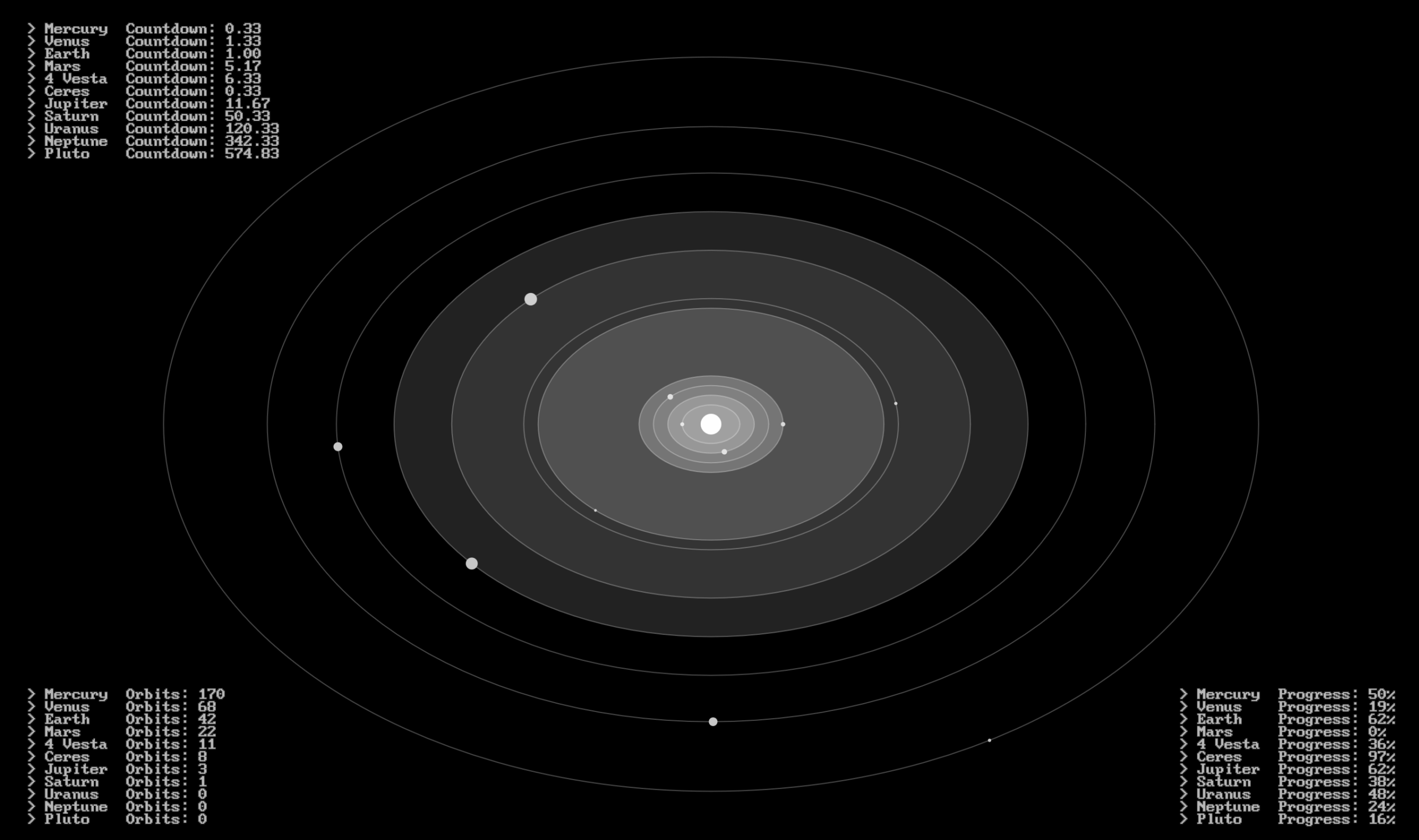
What’s Left
Over the next couple of days I will refine this and refine my musical piece in lead up to Research and Creativity day where I will be giving an oral presentation on this project.
Before I present I will be experimenting with having the text pushed all to one side, adding more text, and most importantly, fixing the synchronization of my music and visuals, I believe I miscalculated either the speed of the music or the speed of rotation of the planets, they do not line up at all.
I will leave you with a link to the High Museum website which shows a glimpse into Ryoji Ikeda’s beautiful work, and a promise that by next week I will have a finished piece and a reflection to share.